


Asset Class Returns - 8/31/2026
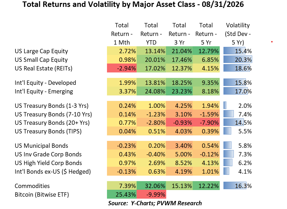
August returns were solid for equity and tame for bonds, given what felt like a volatile rates market this month. Looking at the table above, most monthly returns were positive except for REITs and a couple small negatives in bonds. Similar to last month, US Small Caps lagged Large Caps, but this month International Emerging outperformed Int’l Developed markets. Here are some other observations.
- YTD equity returns show impressive YTD and 3-year annualized returns
- US Small Caps and Int’l Emerging were YTD leaders in equities, but the lower 5-year annualized returns show the deep hole they were in
- It seemed like a big month in bonds, yet monthly returns are mostly muted, and even a little positive
- YTD returns in bonds however are negative for longer duration; the 5-year annualized return for the long bond is still jarring
- The highest returning bond category shown across all time periods is High Yield. In addition to shorter duration, the extra yield above Treasuries (credit spread) helps, though spreads remain very tight (not paid much for extra risk)
- Commodities continued their strong rally, not only from Energy but higher returns in Ags and Precious Metals
- Bitcoin also continued ripping, +25.4% for month bringing YTD pain to “only” -10% after brutal early year sell-off; CLARITY didn’t pass but SEC laid out some rules at least for next few years.
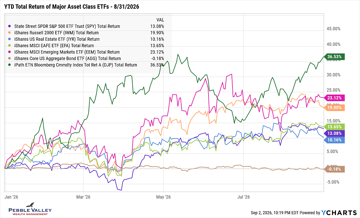
The graph below of total returns of major asset class ETFs captures the movements during the year. Commodities (dark green) continue to dominate and US Small Caps (orange) and Emerging Markets (magenta) are holding their gains. The lonely brown line at the bottom is US Aggregate Bond. The 4.5% yield (46% in Treasuries) was needed to offset falling prices due to rising rates. Note the REIT benchmark used in the table is the DJ Select REIT Index which differs from the ETF.
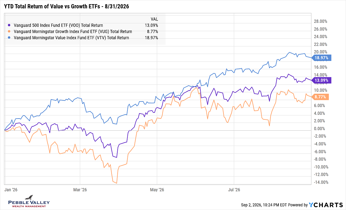
I also include the Value vs. Growth graph this month. I haven’t shown this for a few months as the total returns converged in early June after a wide dispersion one month into the Iran War. The tech earnings season bolstered Growth again but still lags Value by a noticeable amount.
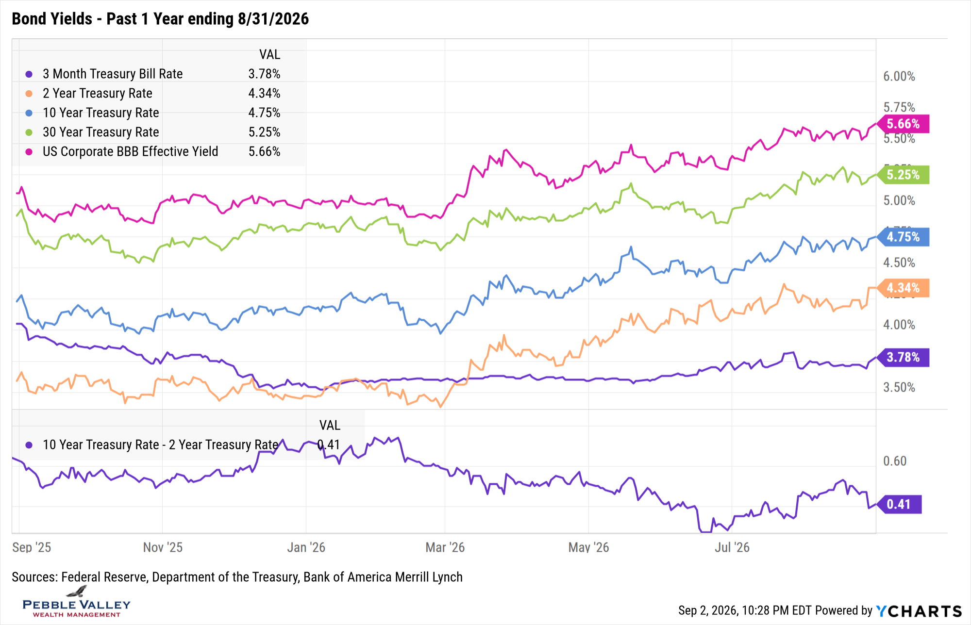
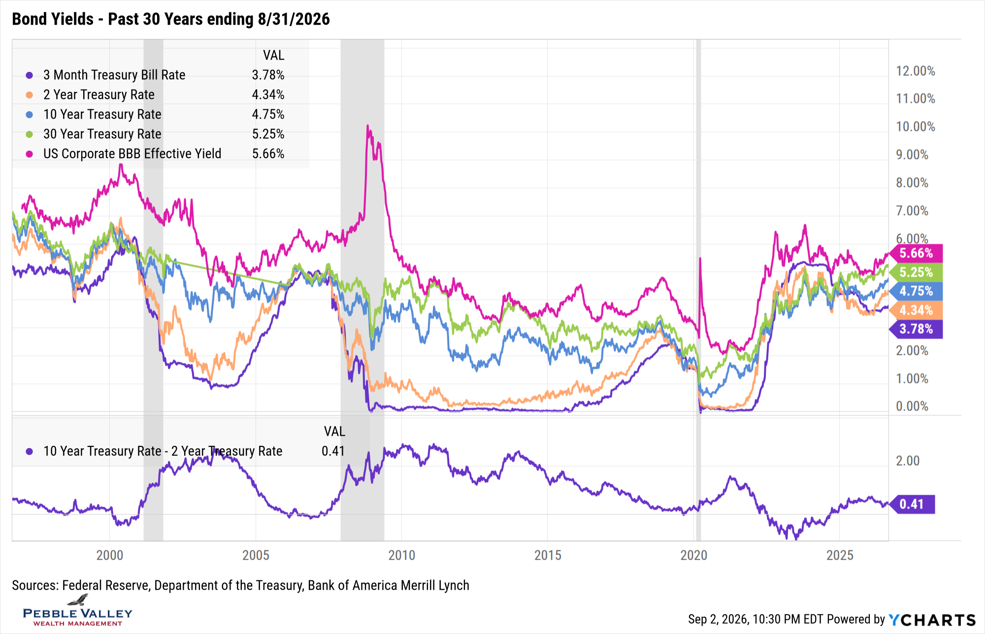
Next are the bond yield graphs over the past one- and thirty-year time frame. Looking at the 1-year chart, I was expecting to see more of a rate move in August, but the monthly change was relatively muted. You will notice the jump in rates the last couple days of the month after Fed Chair Warsh’s Jackson Hole speech left the market expecting a potential rate hike in September. Also take a look at the 30-year time frame and notice current levels perhaps should not be referred to as “higher for longer” but rather as Ed Yardeni puts it, “back to normal”.
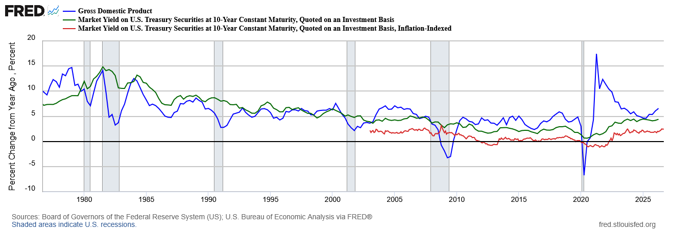
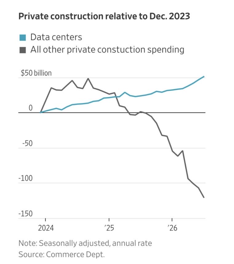
The key drivers of interest rates vary by maturity. The Fed controls the short-end while longer maturities are driven indirectly by the Fed but also inflation expectations, how much debt US needs (driven by deficits) and term premium (need to get paid more to take on longer-term risks). Longer term rates also track nominal GDP (not real, or inflation adjusted). Nominal GDP has been very strong of late, and both nominal and real 10-year yields are tracking accordingly. Where is this GDP growth coming from? Many sources but one big driver is the AI infrastructure buildout, which is estimated to make up anywhere from 1.5 – 2.5% GDP. In addition to the nominal GDP vs. 10-year nominal and real yields, I also show a graph of how AI buildout is dominating private construction spending.
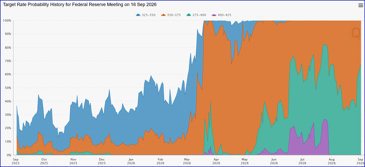
The next FOMC meeting concludes September 16. This meeting will also include Summary of Economic Projections – at least expected. With the pullback from forward guidance, this too may change in 2027. After the tame CPI reading in mid-August, the market was not expecting a rate hike from the current 3.50% - 3.75% level. However, after the Jackson Hole speech at end of August, the Fed Funds futures market started pricing in a 65% chance of a hike at the next meeting. Another CPI report will be released before the meeting (and 2nd out of 3 SS COLA data points!) which will be watched closely. The graph below shows changing probabilities of different rate cuts or hikes priced into the market for the Sep FOMC meeting. After the mid-August CPI print but just before Jackson Hole, the no-hike scenario (orange band) showed about 65% chance. After Jackson Hole, the one-hike scenario (green band) flipped to 65% (Source: CME FedWatch, Sep 2, 2026 pm).
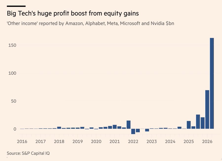
My special topic this month is also AI-related. The latest earnings from tech companies were very strong and projected to continue growing. However, the amount of earnings related to gains in equity investments – often in other tech companies - was quite substantial. Here is a link to my Nov 2025 blog post showing a related graphic at the end. The graph below shows ‘other income’ in billions reported by Amazon, Alphabet, Meta, Microsoft and Nvidia. The change in equity investments can sometimes does down – yes it’s true! – and would have the opposite effect on earnings. This is part of the reason the P/E multiples may seem low for some fast-growing companies. The convenient P/E multiple is applied to next 12-months expected earnings number, but implicitly assumes that one-year estimate will continue at that level for many years into the future.
Welcome to the last month of summer. Other people may refer to it as end of summer, back to school, football season or birthday month! Whatever you call it, enjoy it!
Have questions? Reach out! We're happy to help.
Posted by Kirk, a fee-only financial advisor who looks at your complete financial picture through the lens of a multi-disciplined, credentialed professional. www.pvwealthmgt.com