

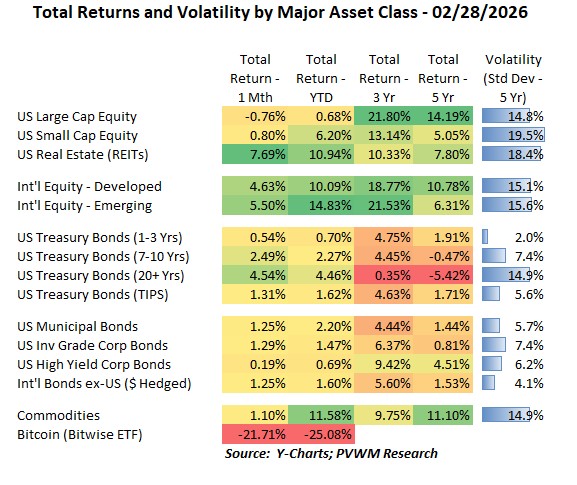
Asset Class Returns - 2/28/2026
My monthly blog post ends with market commentary through the end of prior month – which was Friday Feb 27th. The next morning the Iran bombing was announced bringing added volatility to the markets. This blog post, graphs and comments will mostly reflect action seen in markets prior to that. And while overall market action may seem relatively calm, there is plenty of action going on under the surface. Know what is in your portfolio, and make sure you are not in the group that may hear - “You’re gonna need a bigger boat.”
A quick glance at the table above shows similar characteristics as past months – mostly positive, a few outliers up and down, and nothing getting in the way of International Equities as they continue their steady march higher. Of course, the outliers change and sometimes the driver for the outliers can be related. Here are a few things to note this month.
- The common driver for the four large “green boxes” for the month was falling rates
- 10-year treasury rates fell 29 basis points (-0.29%) while 2-year fell 18 bps
- Falling rates help higher dividend/interest asset classes
- REITs were up 7.7% for the month alone (but recall they lagged in 2025)
- International equities were boosted by a weaker US $; falling US rates relative to other countries can make the US $ weaker, creating bigger returns when converted back to USD
- Their is a direct link to falling rates - higher returns for bonds; the longer the maturity the higher the return – yeah duration!
- Longer dated Treasury bond returns still haven’t recovered from the peak 5 years ago when rates were so low; and duration bit them when rates rose substantially
- Corporate credit yield, especially high yield, was not up as much as Treasuries due to widening credit spreads – i.e. the credit part of rates rising – offsetting some of the gains
- Bitcoin had an ugly month – though most of the pain occurred in the first 5 days of February; CLARITY Act passage is still pending.
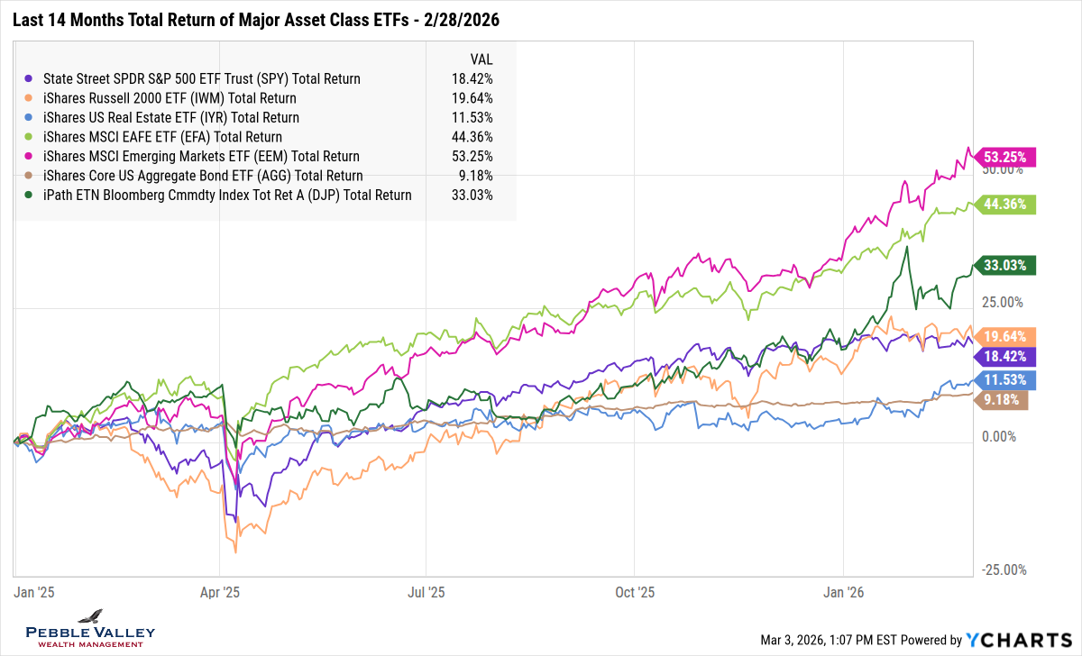
The first graph below shows total returns over the past 14 months of major asset class ETFs. The two top lines are the international equities – developed and emerging – continuing their march higher. Three other lines stand out to me.
- Commodities (dark green) fell hard in late January / early February but have rebounded nicely, with the shiny metals again being the driver
- REITs (blue) were mentioned earlier with the large monthly return; but notice with a 14 month view, they finally came off the bottom return list
- Bonds (brown) are doing what supposed to do – nice and steady returns (barring rate shocks); but what got my attention is a 9.2% total return over 14 months – for bonds!
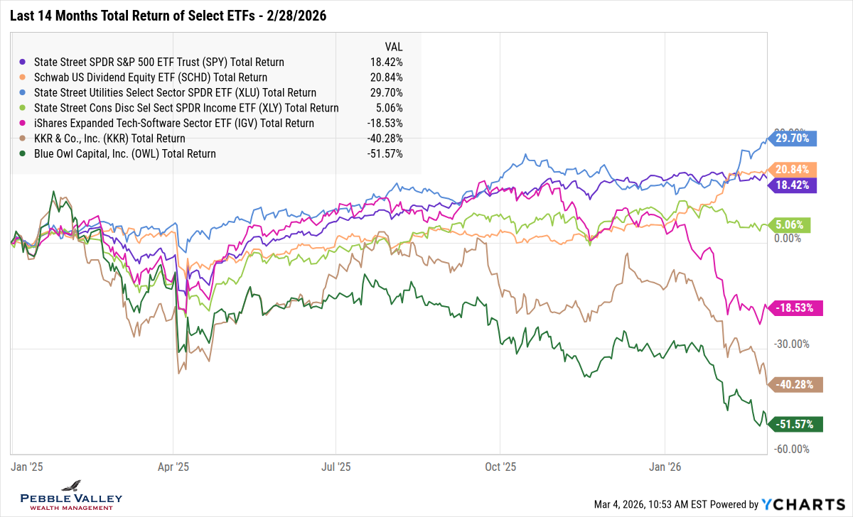
For the “focused graph” this month, I am showing a few different ETFs that captures some major currents going on relative to the more calm S&P 500 (purple line). I show the same 14 month history for visual consistency with the previous graph. Glance up again for the happy, steady “lower left to upper right” line movement of the major asset classes. But underneath the surface, some major changes are occurring. The graph below shows some dispersion within the US Large Caps and Aggregate Bond lines. I’m in bullet point summary mode this blog post so let’s continue.
- Frame of reference is purple line – market cap weighted S&P 500 index
- Sector dispersion – Utilities (blue) to upside (recall big driver of falling interest rates) and Consumer Discretionary (lime) to downside (AMZN + TSLA = 40% weight)
- Defensive dividend factor – Large Cap Dividend Payers (orange) was lagging S&P 500 throughout 2025 but definitely caught a bid starting late last year
- Also note the defensive nature of Utilities and Dividend Payers when markets are weak, as noted in early April 2025 during tariff announcements
- “SaaSpocalypse” – Software sector (magenta) got hit as “software-as-a-service” companies’ pricing power was questioned with release of Anthropic’s Claude AI news
- Where does all this AI investment come from? - Private Credit (brown, green) made large investments in AI-related efforts – and sometimes even with leverage (oh my!); the companies that lend a lot to that sector were also hit.
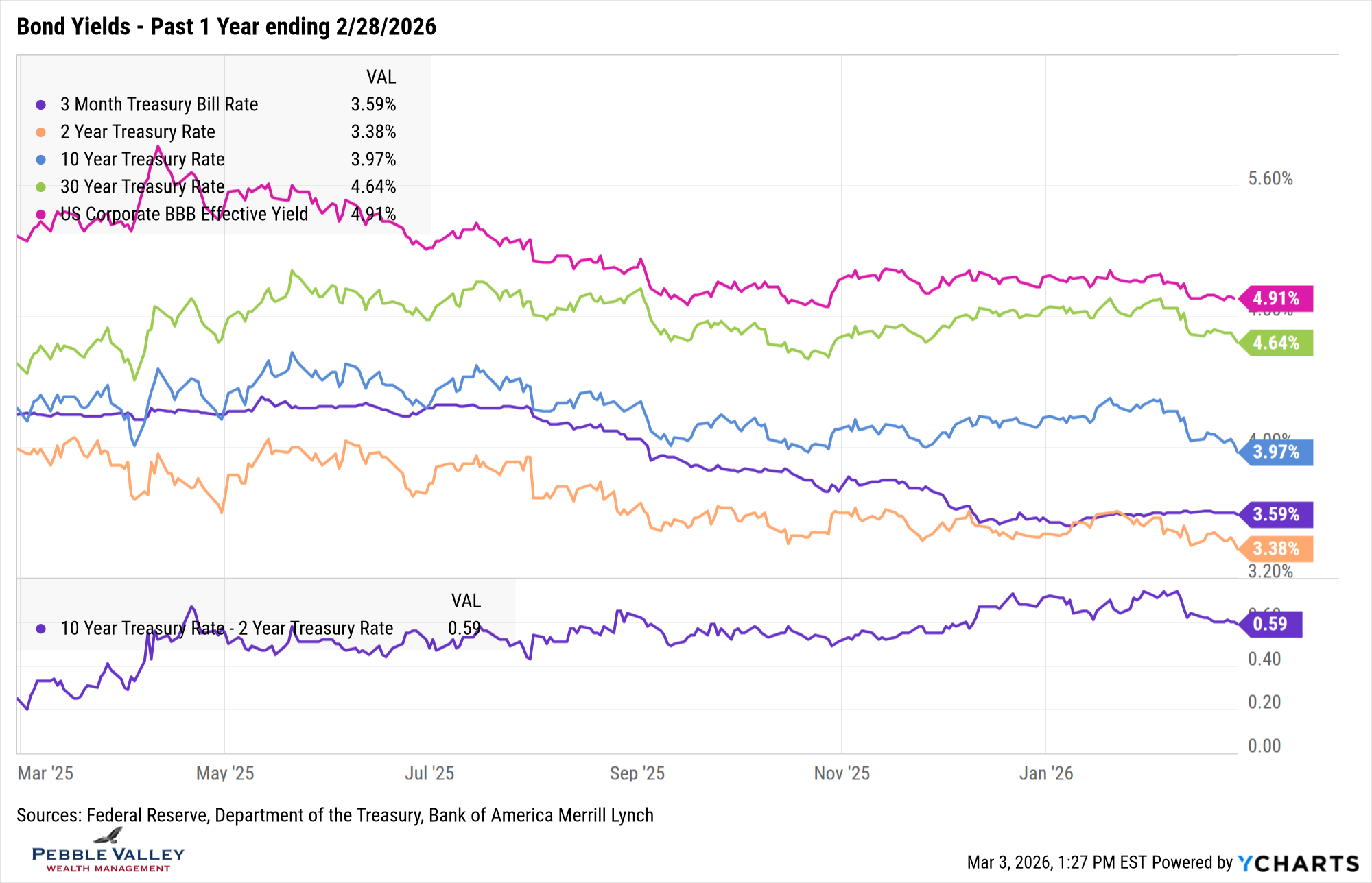
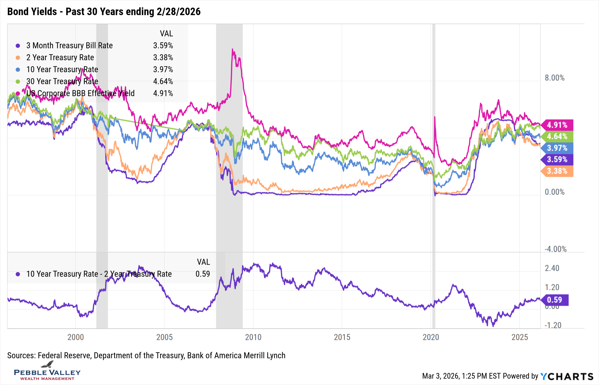
Next are the bond yield graphs over the past one- and thirty-year time frame. Here is what caught my attention this month:
- Pretty big moves in rates over a month
- Given the concerns of potentially slower growth (and potential new Fed chair) the market priced in more rate cuts
- 2-year rates fell 18 bps while 10-year fell 29 bps; curve flattened by 11 bps using bond lingo
- Began to see “sub 6% mortgage rates” articles (though likely fleeting the first part of March)
- BBB yields didn’t fall as much due to credit spreads widening; BBB spreads +18bps; HY B-Rated +36 bps
- 3-month T-Bills remain above the 2-year; for T-Bill investors out there, that is why longer-dated T-Bills have lower rates, as the market is pricing in rate cuts (more below).
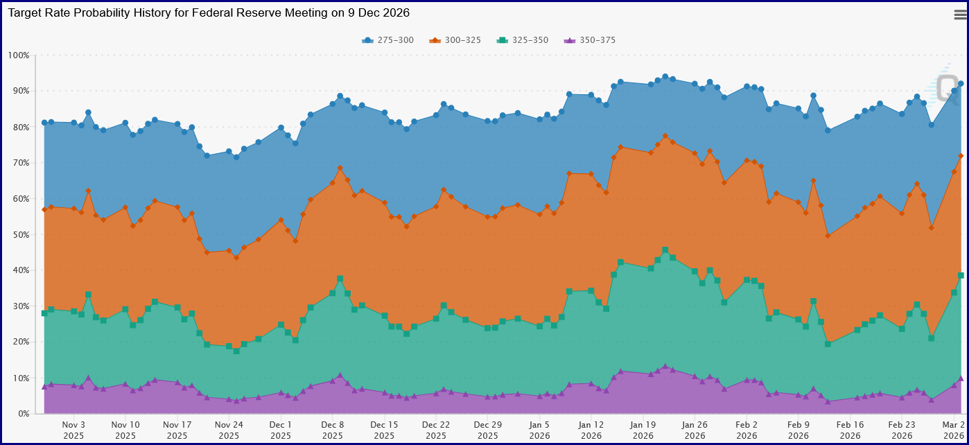
The next FOMC meeting concludes on March 18th. The Fed is expected to hold Fed Funds rates steady at the current 3.50-3.75%. This meeting will also include the Summary of Economic Projections. Given the recent hotter than expected inflation readings – especially on the Fed’s preferred PCE index – it will be interesting to see what the collective Fed is thinking. Of course the range of interest rate levels at year-end 2026–2028 – called the “dot plot” – will also be watched closely. The debate will continue about how the pace of rate cuts may change with the new Fed Chair nominee (Kevin Warsh) who needs to get through Senate approval. See the graph below for the changing probabilities of rate cuts by the end of 2026 (Source: CME FedWatch) as they move back and forth on various news of Fed Chair, inflation readings, and Iran bombing.
As a reminder, I have market and economic graphs on my website which includes graphs of the unemployment rate and inflation. It goes back to 2008 but if want a different range, click on the “customize” link in lower left of each graph.
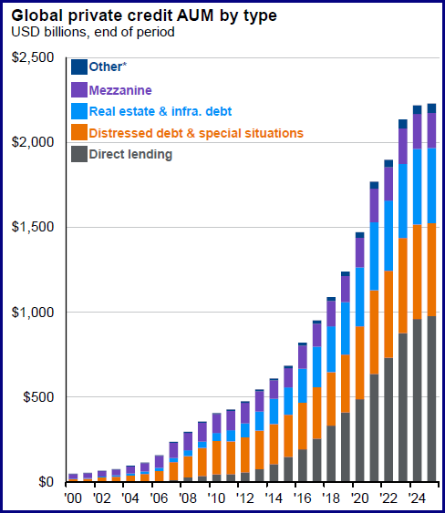
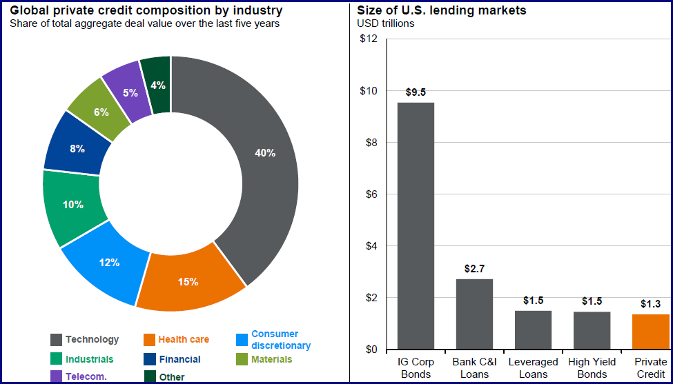
My special topic this month is private credit. Private markets – both equity and credit – have grown significantly over the past 10 years, especially direct lending in the private credit market (first graph below). The overall size of private credit is similar to leveraged loans. A big area of spending lately – and the need for borrowing - has been in the technology sector. In private credit, about 40% of aggregate deals over the last five years were in that sector (second graph below). It is not surprising then that if concerns surface for the technology sector, some of these private credit lenders could face some pressure in the market. Starting last fall, Blue Owl was in the news about a potential deal restructuring. Again in late January, them and other private credit companies (KKR, Apollo, etc. – see price drop in graph above) were in the news about their potential exposure to the software sector as AI capabilities were being announced. I am not saying any of these companies are in trouble, but it is worth noting how the market is viewing their potential exposure and the negative impacts added leverage and illiquidity can have on this market. Most of the private credit market growth has occurred since the last credit cycle so it will be important to see how it handles the next credit cycle. The reported default rates may seem low, but some distressed credit may be masked by “payment in kind (PIK)” status where interest payments are skipped and added to principal amount or equity stakes as the company preserves cash.
"Hey, let's be careful out there."
Source both graphs: JPM Guide to Alternatives – January 31, 2026
Happy March! One of my favorite days of the year happens this Saturday night with clocks moving forward one hour. Bring on the evening sunshine! And with a nod to Jason Gay’s WSJ headline in mid-January, bring on March Madness and Nebraska Basketball!
Have questions? Reach out! We're happy to help.
Posted by Kirk, a fee-only financial advisor who looks at your complete financial picture through the lens of a multi-disciplined, credentialed professional. www.pvwealthmgt.com