

Asset Class Returns - 1/31/2026
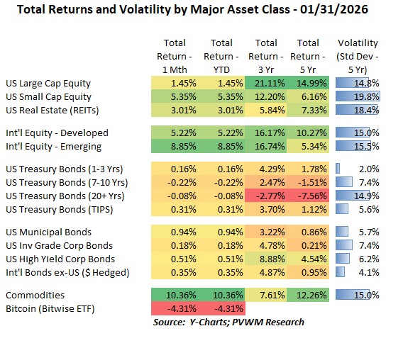
The primary US equity index is the S&P 500. If an investor only focused on that index for January, you would think it was a lackluster start to the year. But other risky asset classes did quite well, especially Emerging Markets and Commodities. Some asset classes were lagging S&P 500 in 2025 and perhaps playing catch-up. For example, US Small Caps had a strong +5.4% return while REITs were +3.0%. International equities picked up where they left 2025, which is a continued march higher. The biggest monthly return was in Commodities, up +10.4%. This return was +16.5% the day prior to month end but precious metals had a huge down day on the last day of the month. For the month, the largest positive contributor came from Energy. A few other things to note from the table above:
- Emerging Markets provided full-year-like returns in the first month, after lagging Developed Markets for many years as noted in the 5-year annualized return column
- Treasury rates rose slightly, leading to small losses for longer maturities
- Municipals started the year very strong, though other credit-related bonds did well, overcoming the negative treasury component of their yield
- Bitcoin continues to trend downward after the relative peak in early October; delayed passage of the CLARITY Act and tepid demand weighs on the market.
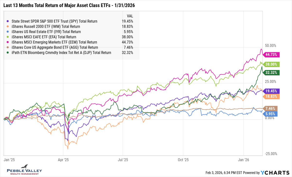
The first graph below shows total returns over the past 13 months of major asset class ETFs. I expanded the list to show a more refined list of asset classes. Yet again, there was a mid-month drop in equity markets but rebounded after concerns over rising global rates, especially in Japan, settled down and US rates reversed their sudden rise. Commodities are the green line – rising rapidly in January as Precious Metals continued the parabolic rise but then had a sharp reversal at the end of the month, driven by Silver and Gold -28% and -10% drops respectively. The added volatility and rapid price rise required the CME to raise margin requirements that was announced the last day of the month causing further selling.
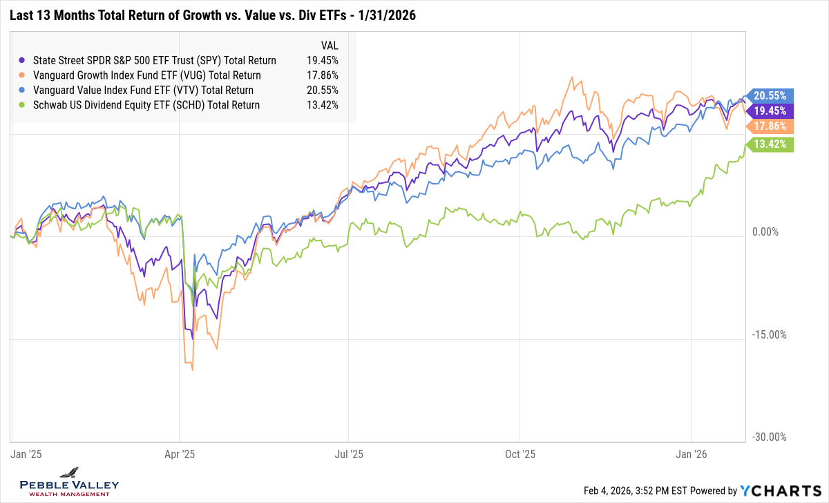
This next graph captures an old theme that warrants attention periodically – Growth vs. Value. In last month’s blog post I shared graphs illustrating the concentration of the S&P 500 – with the top 10 names making up over 40% of the index. None of those names were “value” stocks. If there comes a time (I used to say ‘when’ but it has been a long run) when these large growth stocks cool it will have a more pronounced effect on the S&P 500. In turn, it will favor the portion of the portfolio with a value lean. I also added a ‘factor-like’ ETF capturing Value with dividend focus, as that had been lagging even worse than just Value, but came to life this month as well after lagging in 2025.
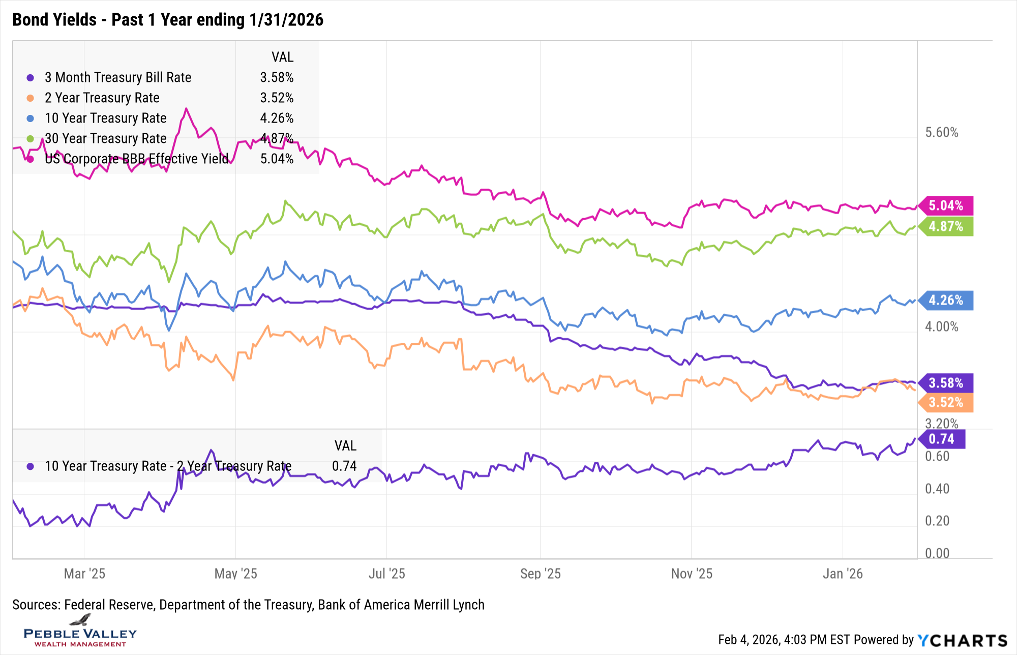
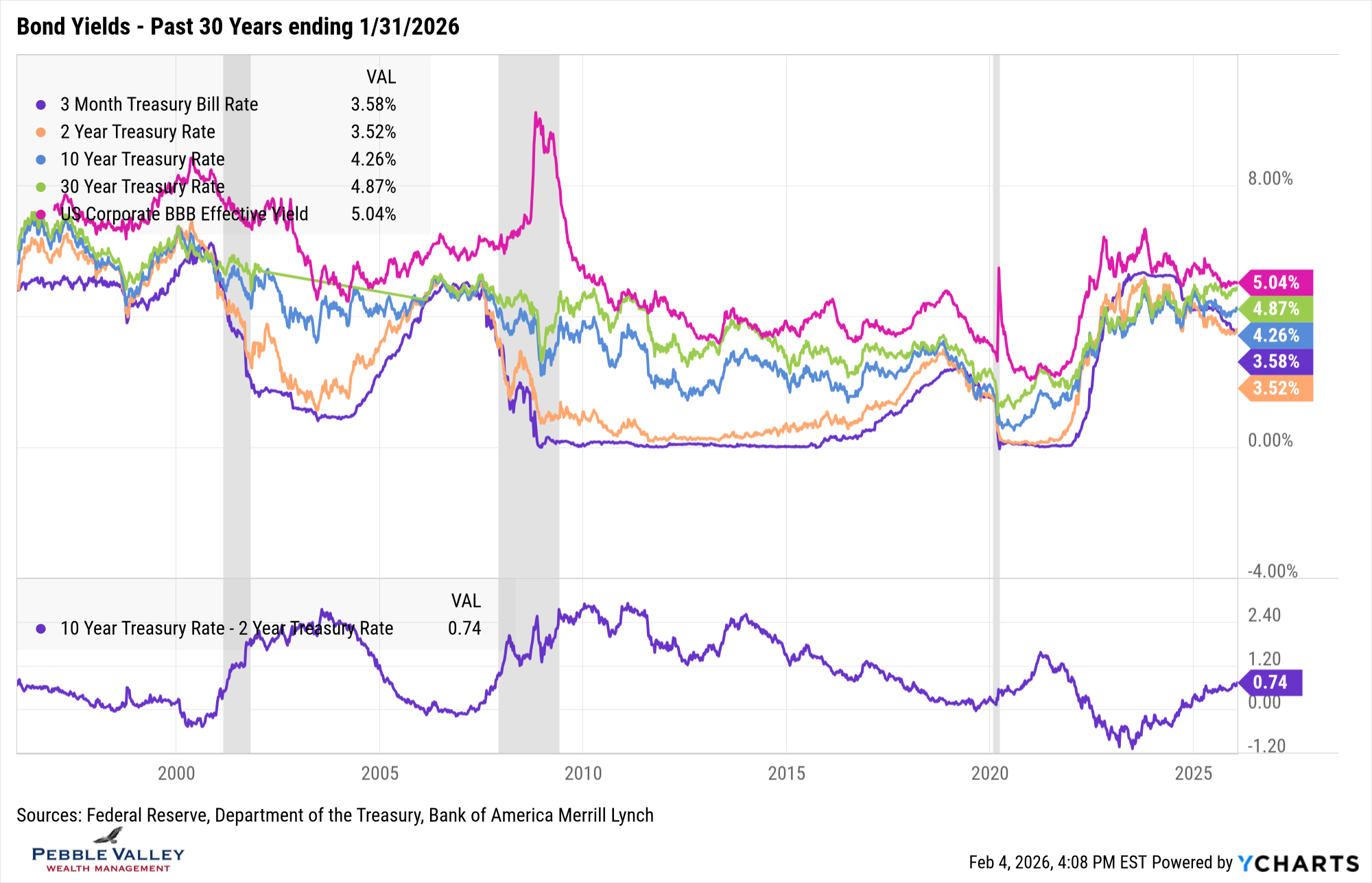
This month I am changing the bond yield graph slightly. I first show the yields for the past one year which provides more granularity to visually capture recent moves, followed by a much longer thirty year history for context. Yes Virginia, 7+% mortgage rates can exist! For the astute readers of this blog, you may notice I dropped the 10-year TIPS yield. With the much lower yield I was losing the granularity I was after with the one year graph and when I added it to the thirty year there was a mismatch on line colors. At least the magenta line survived! Here is what caught my attention this month:
- The stronger jobs market caused the market to price out some of rate hikes, causing the 2-year rate to drift back up
- Longer maturities continue their walk higher, leading to a slightly steeper 2s/10s curve
- BBB vs. 10-year shows credit spreads managed to tighten even more; now at +0.78%
- Taking the longer view, current rates may seem high since the last 16+ years had such low rates post financial crisis, but they were at these levels or higher prior to that.
The first FOMC meeting of 2026 concluded on January 28th. The Fed held rates steady at 3.50-3.75%. The fourth sentence of the press conference from Chair Powell summarized the state of their dual mandate – “While job gains have remained low, the unemployment rate has shown some signs of stabilization, and inflation remains somewhat elevated.” And then before opening it up for questions, he summarized the committee’s view at large (there were two dissents) that the current rate is in neutral range – “We are well positioned to determine the extent and timing of additional adjustments to our policy rate based on the incoming data, the evolving outlook, and the balance of risks. Monetary policy is not on a preset course, and we will make our decisions on a meeting-by-meeting basis.” In addition to the exciting economic questions, this press conference was sprinkled with various legal and political questions. Chair Powell’s response used a few times – “I have nothing for you on that today.” reminded me of Bill Belichick’s “We’re on to Cincinnati” press conference years ago. Trump announced his nomination of the next Fed Chair – Kevin Warsh – a couple days following this meeting so no direct questions on Warsh. Here is a link to the FOMC Meeting Statement and Press Conference Transcript if interested.
As a reminder, I have market and economic graphs on my website which includes graphs of the unemployment rate and inflation. It goes back to 2008 but if want a different range, click on the “customize” link in lower left of each graph.
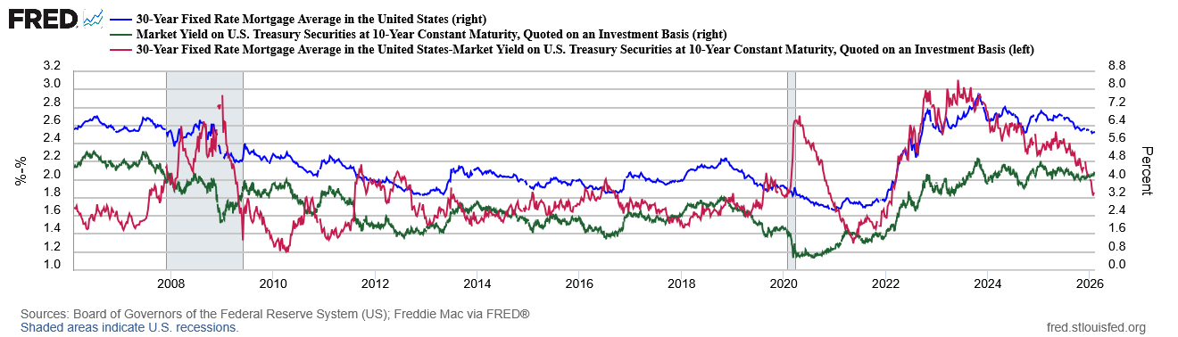
My special topic this month is mortgage rates relative to the 10-year treasury rate. The graph below shows each of these rates (mortgage is blue, treasury is green; right hand scale) along with the difference (red; left-hand scale) over the past twenty years. Note the mortgage rate is weekly average based on applications submitted to Freddie Mac and may include rates with fees/points. The intent is to show the trend, not the latest rate you can lock today.
I include the spread between mortgage rates and 10-year treasury to highlight the recent compression. Yes mortgage rates will continue to be driven by 10-year treasury rates, but the administration is focused on getting mortgage rates down. On January 8 the administration announced that Fannie and Freddie (government agencies) will purchase an additional $200 billion of mortgage bonds. It may seem small relative to overall size of the market but the marginal buyer matters and there may be more behind it. You can see the spread dropped about 0.60% relative to even just six months ago. It will also be interesting to watch the actions of the Treasury and the new Fed Chair – if approved – on how they work together to balance interest levels, treasury debt issuance maturities and other policy efforts to try and bring down mortgage rates. For recent mortgage buyers, get your “refi person” ready for potential action.
Enjoy the two major sporting events coming up – Super Bowl and Winter Olympics – and watch the finest compete… and inspire dreams!
Have questions? Reach out! We're happy to help.
Posted by Kirk, a fee-only financial advisor who looks at your complete financial picture through the lens of a multi-disciplined, credentialed professional. www.pvwealthmgt.com