

Asset Class Returns - 1/31/2022
Here is this month’s market summary. Unless noted, the time frame is year-to-date with screen shots through 2/2/2022.
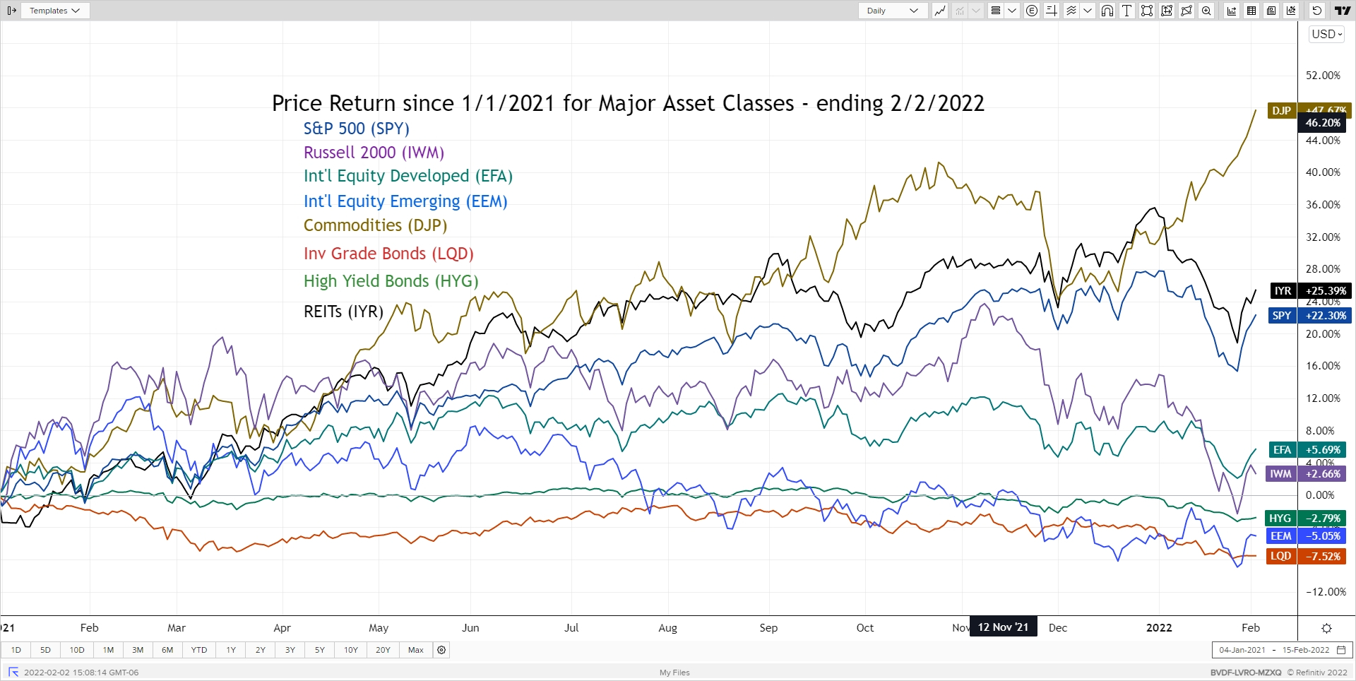
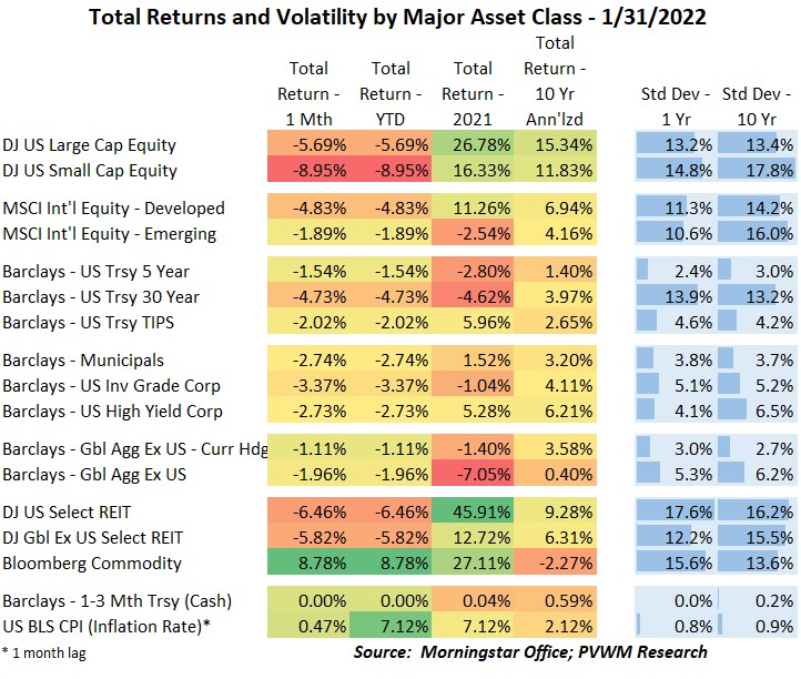
The first month of 2022 saw mostly red across the major asset classes except for commodities which had an eye-popping 8.8% return. On a related note, the only other positive value in the table at the bottom of this blog post is inflation, which ended 2021 up 7.1%. Even bonds had some nasty negative returns – more on that later.
Looking at the usual major asset class graph – and expanding back to 1/1/2021 for context – the US equity markets pulled back more than international. This was especially true for small caps which contains faster growing companies. The valuation of these companies were hit harder by the expected higher rate environment. Also coming off the heat of 2021 was REITs – both from a risk-off perspective and impacted by higher rates. All returns captured at month-end were even worse before rallying the last few days of the month.
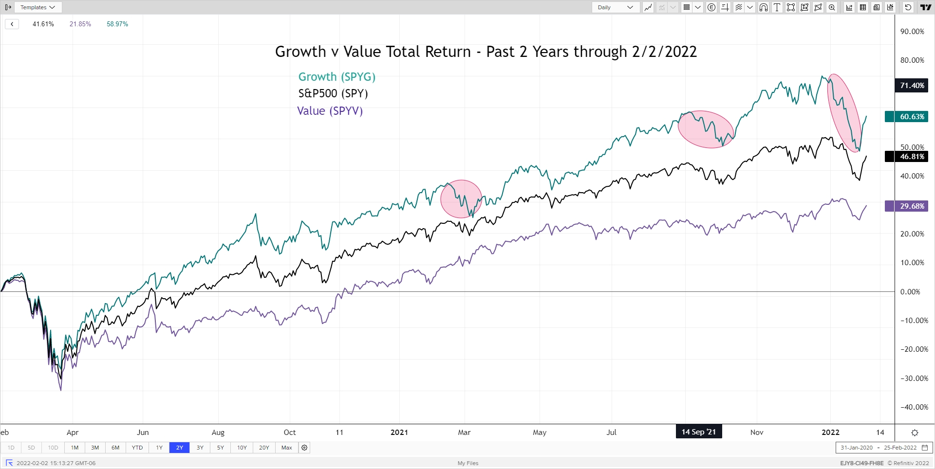
The Growth v. Value chart this month expands to a 2-year view. I also highlighted times in the past where real interest rates saw a relatively fast increase (became less negative) to show the larger negative impact on Growth stocks vs. Value. At the relative lows on January 27th, Growth was down about -13% while Value was only down about -4%.
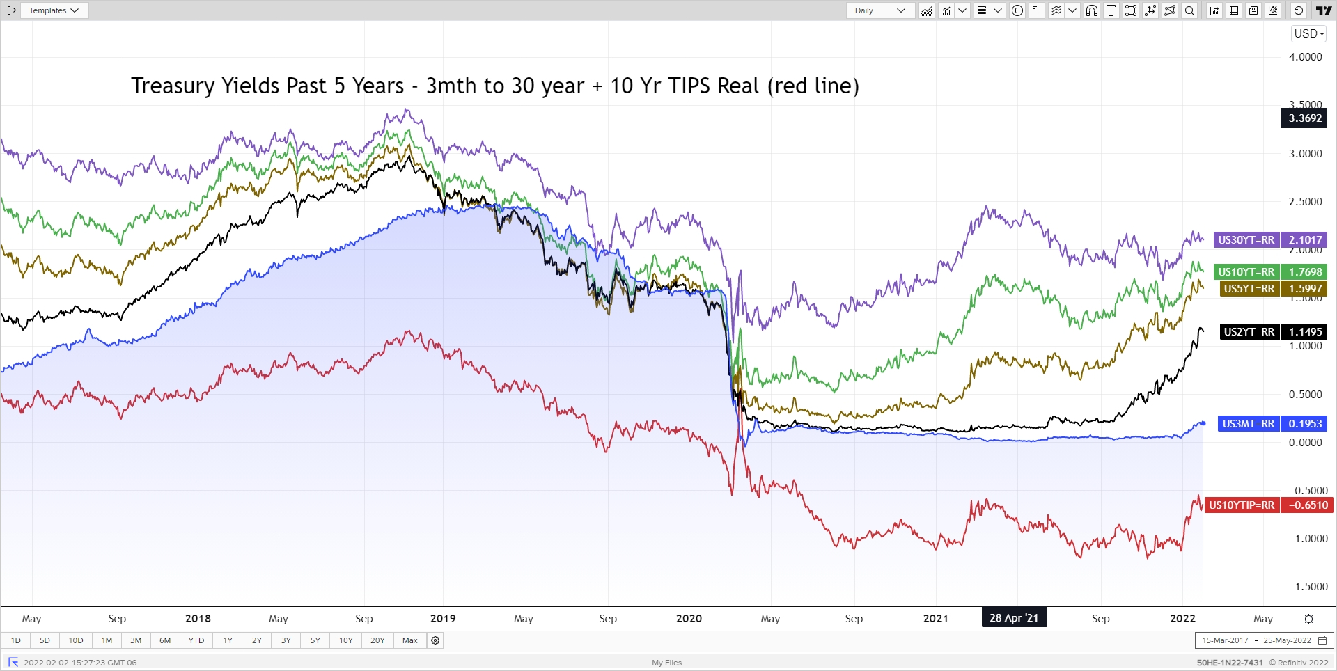
My usual rate graph looks, well, higher. Using that 2022 vertical line and moving your eyes to the right you can see a noticeable increase. Heck even the 3-month treasury bills (blue line) are starting to show some life as that time period now includes about 1.5 months AFTER the March 16th Federal Reserve meeting where the Fed is expected to start raising rates. Will it be 0.25% or 0.50%? I expect 0.25% - which is priced into the markets – but also dependent on upcoming jobs and inflation reports. Looking at these higher rates in the graph and the table at the end of this blog post is a great opportunity to visualize DURATION in action. In the graph, notice how the 5-year rate (brown line) rose quite a bit more than the 30-year (purple line). Recall as rates rise, bond prices fall. Now go down to the table and notice that 5-year treasuries lost about -1.5% in January while 30-year lost about -4.75% even though those rates didn’t rise as much. What gives? The duration of a 5-year treasury is about 4.8 while the 30-year is about 22.4 – over 4 times as much. And while you are down in the table, you may be wondering how TIPS can be down -2% when inflation is running so hot? TIPS have duration also – the 10-yr TIPS about 9.9 – and the real yield on TIPS rose also. So “be sure to drink your Ovaltine” – but also know your bond duration!
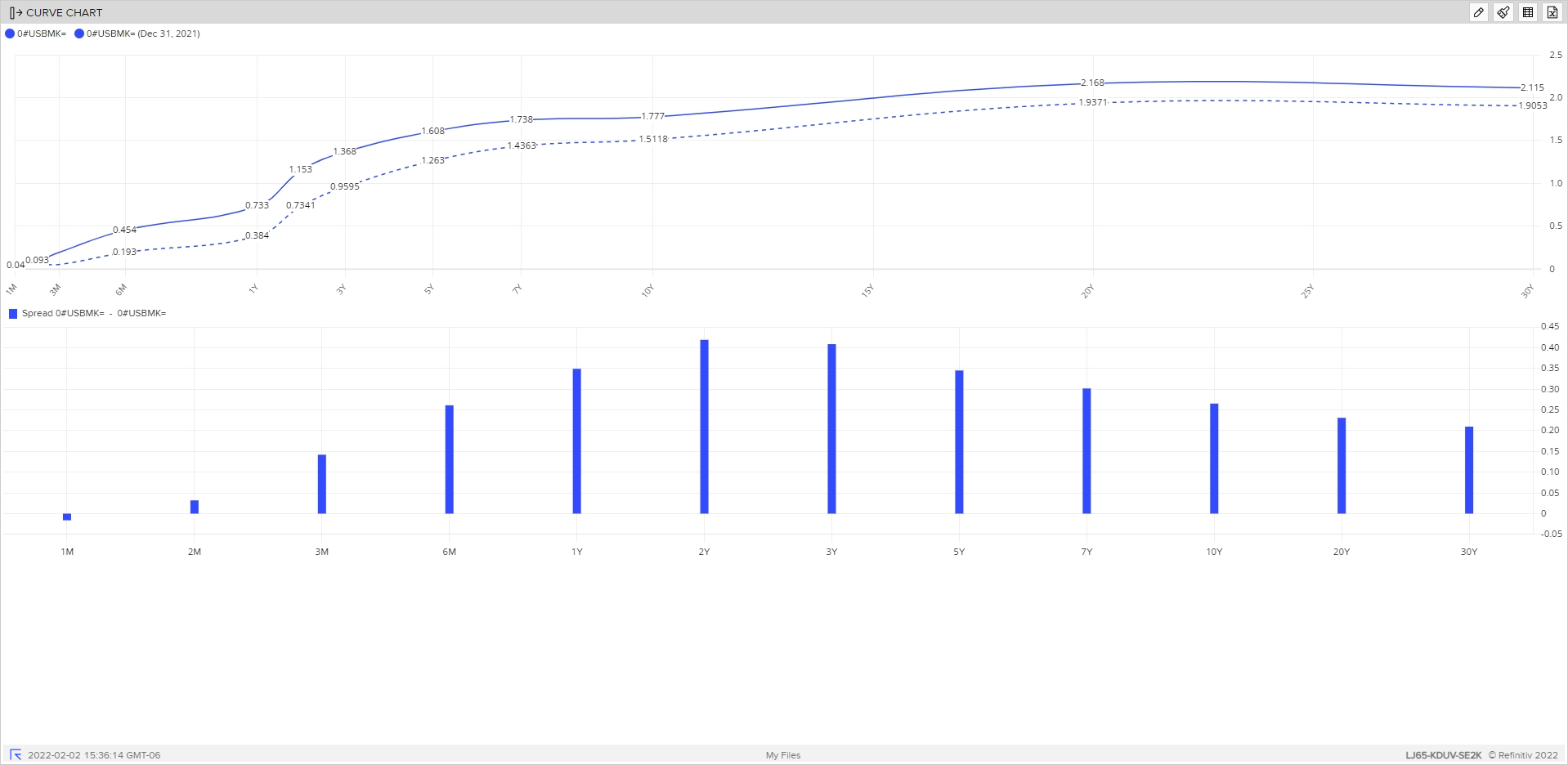
I also show a graph of the full treasury curve as of 2/2/2022 (solid line) compared to 12/31/2021 (dashed line). The bars below it show the change in rates between these time periods. The 2-year rate rose the most – about 0.42% - compared to the 10-year at about 0.26%. This is called a flattening of the yield curve as the 2-year rate is more sensitive to near-term Federal Reserve rate action. The longer-term rates are driven more by market expectations of growth and inflation – and the willingness of the Fed to do something about it. A new factor driving these longer-term rates is the Fed no longer buying bonds (tapering) after March and the eventual reduction of the Fed’s balance sheet – no really – later in the year. TBD!
Happy Groundhog Day! May you see yourself embracing whatever the next six weeks throws at you.
Posted by Kirk, a fee-only financial advisor who looks at your complete financial picture through the lens of a multi-disciplined, credentialed professional. www.pvwealthmgt.com