

Robust Jobs Report: A look at 3 Key Measures
A key barometer for the health of the economy can be found in the jobs report. If jobs are being created and wages are rising, more money is in consumers’ hands which fuels economic activity as they spend. The latest jobs report (typically released the first Friday of the month) showed a very solid jobs picture. Here are the headline numbers followed by graphs and further explanation of the key measures.
- Unemployment rate rose to 3.9% but participation rate rose to 63.1%
- 312,000 new jobs in December + 58,000 from previous months’ revisions
- Average hourly earnings rose 3.2% over past year
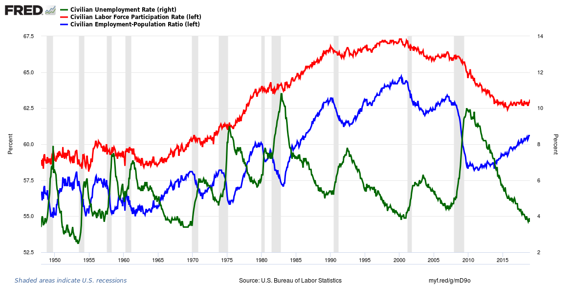
The headline number most reported in the news is the unemployment rate. This is from the Household Survey (phone calls to 60,000 households) and represents the number of unemployed – must be actively looking for work - as a % of the labor force which is the sum of those with jobs and those actively looking. The rate has been below 4% throughout much of 2018 which is very low historically (green line - rhs). A related rate is the participation rate which represents the number of people either with jobs or actively looking as a % of the working age population defined as age 16+ (red line - lhs). If the number of new jobs stays flat but the number of people looking for a job increases (i.e. - participation rate increases), you will have a rising unemployment rate even with flat jobs. There are even times like this month when there can be a large increase in jobs but even more people started looking for a job (entered the labor force) resulting in a solid number of jobs and an increasing unemployment rate.
Here is a long-term graph capturing the broad trend in participation rates and the fluctuating unemployment rate around recessions (the grey bars).
For those who like to see the math behind the impact participation rate has on unemployment rate, consider this example using simple assumptions. (Note: there can also be differences in 'Household' v. 'Establishment' reporting which impact but focus here is on participation impact.)
Month 1
- 100 people age 16+, of which 61 have a job and 4 are looking; means 65 are in the labor force
- Participation rate = 65/100 = .65
- Employment rate = 61/65 = .94
- Unemployment rate = 4/65 = .06 (or 1 – Employment Rate)
1 Month Later...
- Assume one of 4 people looking got a job but 2 more people started looking; now 67 are in labor force
- Participation rate = 67/100 = .67
- Employment rate = 62/67 = .93
- Unemployment rate = 5/67 = .07
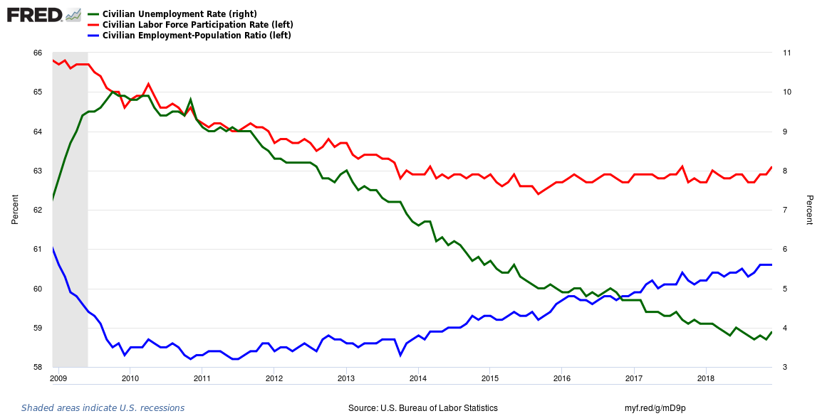
Here is the same graph as above but only showing the past 10 years so you can see this dynamic at work.
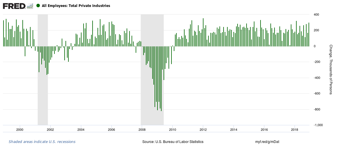
The other common number cited in the jobs report is the number of new jobs created. This is from a separate Establishment Survey (tracks 650,000 worksites) and is simply the number of new jobs created or lost over the month. In addition to the current month data release there are often revisions to the prior two months. The latest report showed not only a large number of new jobs created but also large revisions – for a total of 370,000 new jobs from previous report. Some view the 3-month average of job gains to help smooth the trend. Here are the number of private payroll jobs over the past 20 years which captures the impact over two recessions.
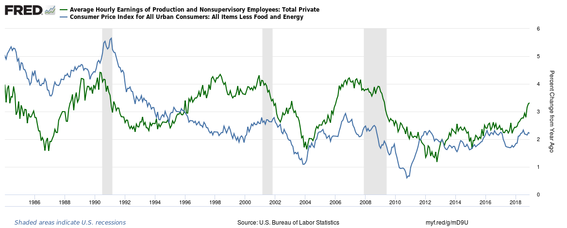
The last key measure I'll discuss is the increase in hourly wages. Solid wage growth is good for the consumer and represents robust demand for labor and a healthy economy. If wages grow too fast however, that can add to inflationary pressures which can have a negative effect. The Federal Reserve is watching inflation and economic growth closely as it determines the pace of future rate increases and run-off of its large balance sheet. The graph below shows the annual wage growth vs. CPI-CORE over the past 35 years.
When people have jobs, and getting paid more for their job, there is more money circulating in the economy adding to growth. The jobs report contains important objective data that help inform how well the economy is doing.
Posted by Kirk, a fee-only financial advisor who looks at your complete financial picture through the lens of a multi-disciplined, credentialed professional. www.pvwealthmgt.com