

Risk – How do you define and use it? (Part 1-Investments)
Risk can be many things - a game; an opportunity; a 4-letter word. An early pioneer of the high yield market (Michael Milken) said “Risk is a function of knowledge.”
For an investor, it can be all of them (though maybe only speculators refer to it as a game). In the financial world, very few things are known with certainty. Probably the closest is a short-dated US government debt instrument, though reinvestment risk remains (more on that later). Everything else has different degrees of risk. Different measures help quantify a given risk. There are techniques and products to reduce it. It is important to be comfortable with the amount of risk you are taking.
This blog post will look at the different risks related to an investment portfolio. The next blog post will address risks in your broader financial life. Investment-related risks can be viewed at the security level or portfolio level. Some risk metrics can be applied at both levels. Here are a few of the common ones.
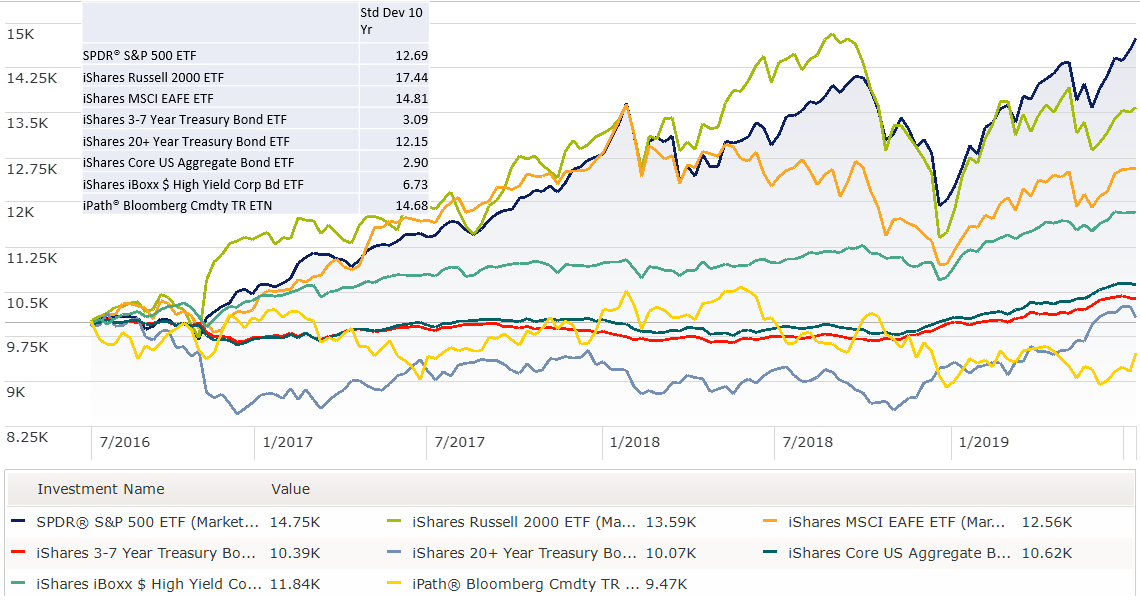
Standard Deviation captures how much the price of a security or value of the portfolio can move up or down around the average value. It is expressed as a % price change on an annual basis and calculated over a given historic time period. The value can vary based on the history used. The price change can be “+” or ”–“ the amount of the standard deviation away from the average. If you assume the security price changes have a normal distribution, about 67% of price range move will be within one standard deviation and 95% of the moves – again both up and down – will be within 2 standard deviations. This metric sometimes is referred to as Volatility but in this context it is historic volatility. The graph and summary statistics below show the actual price action and standard deviation for a few securities across the risk spectrum. The investor can use this information to determine if they can stomach moves in their holdings by that magnitude.
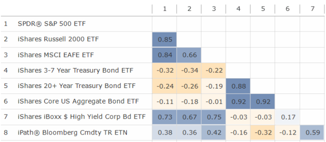
This same concept can be applied at the portfolio level. An additional metric called correlation coefficient needs to be included in the calculation to estimate potential offsetting price movements of the different securities. Correlation can also change over different time periods, not only from different market environments but different fund availability, like an asset class accessible through an exchange-traded fund. Correlation is expressed as a number between -1 and +1 with the former meaning two securities move in exact opposite direction and the latter the same direction. In times of market stress you may hear the phrase “all correlations move to 1” meaning everything is moving in the same direction – down. To be clear, a +1 doesn’t mean they only move up, it just means they move together. The table below shows the correlation for the same securities as above. The investor can use this information to determine if they have some offsetting securities in their portfolio which may help smooth the portfolio ups and downs – one zigs while the other zags.
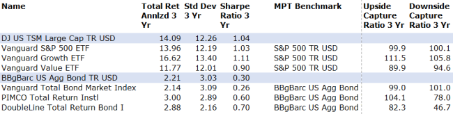
Since there is no free lunch – except diversification - an investor should not just focus on returns but also the risk taking to get those returns. A metric called Sharpe Ratio captures the return over the risk-free rate divided by the standard deviation. The higher the ratio the better the risk-adjusted return. While the measure can be used across all asset classes, it is best used when comparing different securities in the same asset class. You can have a very high Sharpe Ratio if the volatility is low which is why more helpful with an asset class which should have similar risk. The value will depend on the return for the given period. Bond securities can have higher ratios due to the lower standard deviation, not necessarily higher returns. The time period used will impact the result, but again if using within an asset class it still provides solid relative information. Below are Sharpe Ratios for different securities on both US equities and US bonds. The investor can use this information to determine which security within an asset class provides the best returns given the price risk taken.
A security is part of a broader asset class. A benchmark index is a portfolio of securities for a given asset class. The Upside Capture Ratio of a security shows that security’s return during an up market (defined by the index) relative to the index return during this same time up market. It is typically expressed as a percentage and can be positive or negative. A ratio of +95 for example means the security captured 95% of the index returns during an up market. A +25 means only 25%. The value can be over 100% and below 0%. It is important to know what benchmark index is being used for a given security. There is a similar Downside Capture Ratio which captures the same information during a down market (defined by the index). A ratio of +95 means the same thing – the security fell by 95% of the index returns; +25 means if index was down 10% during down markets this security was down 2.5%. You can also have a negative downside capture ratio for defensive securities. A -30 would mean if the index was down 10%, this security was up 3%. You should expect passive index securities to have ratios very close to +100 and actively managed securities to deviate. I show a few actively managed or factor-based securities’ ratios below. Again, be sure to check benchmark index. The investor can use this information to determine how closely a given security will perform to the asset class benchmark.
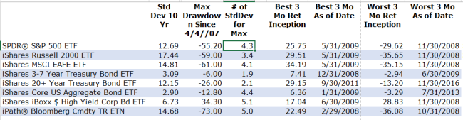
While standard deviation has historically been used to help an investor know how far a security could fall, there is nothing like actually experiencing a price drop to help crystalize your reaction. It could also be a large price rise but that provides a different reaction! A metric called Max Drawdown shows the actual largest % drop in value from peak to trough over a given history. It doesn’t tell you over what time period this loss occurred and often (though not always) the peak and trough are occurring at multi-standard deviation events. One may have a different view when seeing a 1-standard deviation potential move vs. the actual “holy smokes” reaction of an actual collapse. In hindsight an investor may believe they can hold on to a high returning asset, but sometimes securities with large max drawdowns can shake the steady investor at the exact wrong time. There is no comparable “max meltup” metric but a close cousin is Best and Worst 3-Mth Return. This gives you both up and down and a defined time period – but be sure to know how far back the data goes. The investor can use this information to see what has actually happened and set potential “statement shock” expectations.
All the above apply to both equities and bonds. Here are few additional risk metrics specific to bonds.
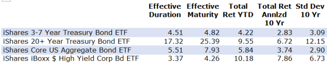
Standard deviation described above will capture the historic price volatility of a bond. With a bond, as rates rise the bond price falls and vice versa. Intuitively, if you buy a bond with a 2% coupon when the going rate is 2% you will pay “par” or $100 for the bond. If suddenly the going rate rises to 3%, your 2% coupon bond isn’t as attractive. The price must fall for this lower coupon stream vs. buying a new 3% bond at $100. A bond with a longer maturity has more coupons that need adjusting in the price. A metric that approximates the change in bond price for a given a change in yield rate – either treasury or credit spread – is called duration. It is expressed in years and approximates the % change in price for a 1% change in rate. If the change in rate is up the price drops; if the rate change is down the price is up. The investor can use this information to know how much the bond will change in value given the change in rate. Using the table below, if a parallel rate rise of 1% occurs, the 3-7 Yr Treasury Bond ETF will fall about 4.5% in value; the 20+ Yr Treasury Bond ETF about 17.5%.
Some investors may use a bond ladder. This involves buying individual bonds (or CDs) in equal amounts at maturities for say a 5- or 10-year period. Then as a bond matures, a new bond is purchased with the longest maturity of the ladder. This approach allows new money to be invested at current rates each year and is more common for an investor focusing on current income. The risk here is reinvestment risk where rates may be lower when time to purchase the new bond. The ladder approach is a technique to mitigate that risk but is still present and hurts most in steadily falling interest rates over time. An investor with a 10-year ladder the past 10 years would be reinvesting in lower rates. Two additional risks that can be magnified in this strategy if the size of the portfolio is too small is liquidity risk via paying a wider bid/ask on smaller bond purchases and default risk could potentially hurt more if not properly diversified. There is no summary metric. The investor should be aware of this risk.
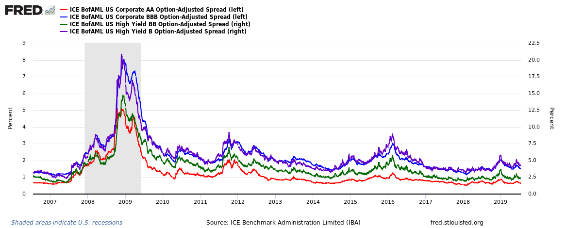
The other bond specific risk is when the company is unable to return your full principal (the $100 in example above) at maturity of the bond, called default risk. The extra yield over treasury rates – a metric called the credit spread – captures the chance of default and expected recovery if default. The wider the credit spread (the higher the yield over treasury) the greater the chance of not getting your full $100 back. The higher current yield is what the market pays you to take that risk. A non-market based risk metric getting at the chance of default (but not recovery if default) is the bond rating. Investment-grade bonds have AAA, AA, A and BBB ratings; high yield bonds have BB, B and CCC. The investor can use credit spreads to see how much the market is pricing in the chance of not getting all your money back; bond ratings reflect how likely a default is based on the balance sheet and business model of the company. NOTE: the investment-grade spreads in graph - red and blue line - are on the left scale.
If you made it this far, thanks for reading. There won't be a quiz on these common risk metrics but consider them during your portfolio review. If some of them are outside your comfort zone, take action or call for help. Watch for my next blog post on common risks faced on your broader financial life.
Posted by Kirk, a fee-only financial advisor who looks at your complete financial picture through the lens of a multi-disciplined, credentialed professional. www.pvwealthmgt.com