

Inflation – Coming Down but Still High
The path of inflation and the response by the Federal Reserve and markets is important. This blog post will put current inflation levels in context with historical levels and show different inflation gauges. While some indicators are coming down rapidly, levels remain quite elevated and some measures haven’t been falling as much.
Background
Inflation has been a topic that has dominated the financial news and personal pocketbooks the last couple years. We saw higher prices across the board – from grocery bills to higher rent to vacation costs and a night out. And since the Federal Reserve has a mandate to achieve price stability, they raised short-term interest rates from a range of 0.00% - 0.25% all the way up to 5.25% - 5.50% since March 2022 in an effort to slow inflation while keeping the jobs market stable. These higher short-term rates led directly to higher borrowing costs for credit cards and home equity lines of credit, and indirectly to much higher mortgage rates for new home buyers – currently about 7.5%!
But there were some favorable effects also. Savers can actually earn a reasonable interest rate on cash savings in the 4-5+% range, Social Security recipients saw a large 8.7% increase in benefits for 2023, and many learned about I-Bonds after the crediting rate was set to 9.62% for a given 6-month window (currently at 4.30%).
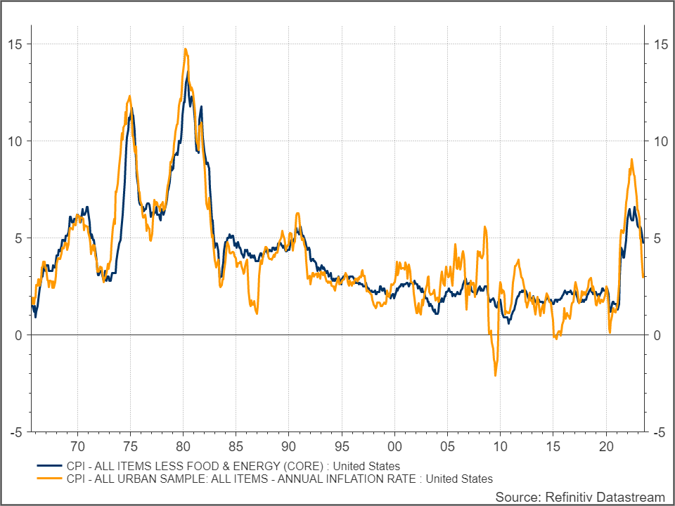
Historical Headline and Core Inflation
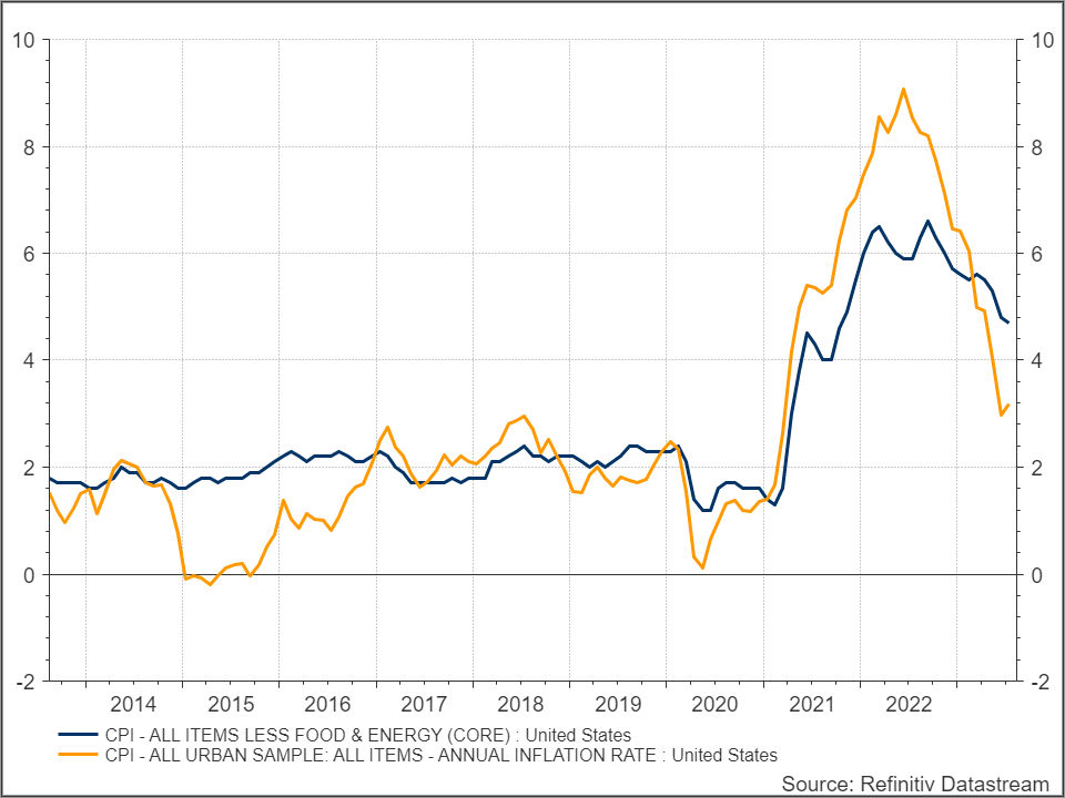
The most common inflation gauge is the Consumer Price Index (CPI) published monthly. There is also a Core CPI which excludes the more volatile Food and Energy components. Yes, we must consume those components, so it is part of the inflation our pocketbooks feel, but it provides economists a more stable and reliable indicator. The two graphs below show both CPI (orange – 3.2% latest) and Core CPI (blue – 4.7% latest). The first goes back to 1965 so you can see where current levels compare to the extreme inflation readings of the ’70s but also how tame inflation has been (especially Core) in the last couple decades. I then show both indicators over the past 10 years for more granularity of the current environment. All future graphs will be based on the past 10 years.
Using the 10-year graph you can see that Core CPI did not spike as high as Headline, but it also is not falling as much. This trend bears watching.
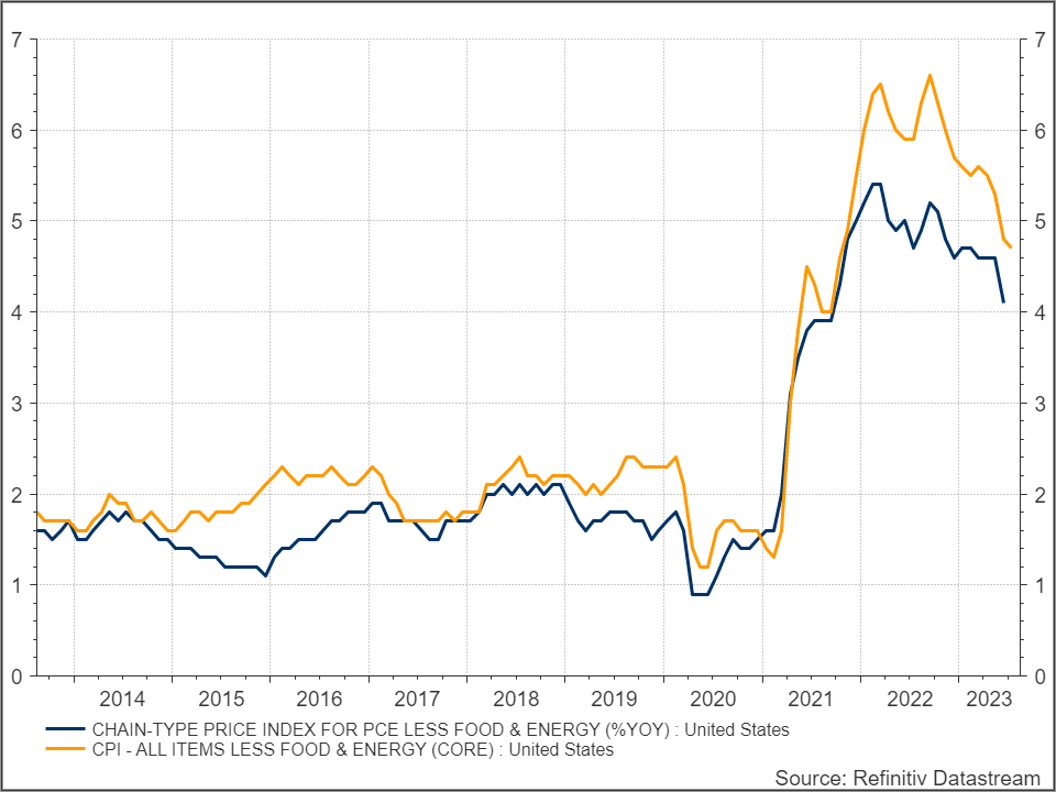
Federal Reserve Preferred Indicator and Target
While the CPI is recognized for most people as their inflation gauge, the Federal Reserve uses the Personal Consumer Expenditure (PCE) index. In general, CPI uses a narrower definition of urban expenditures made directly by consumers, while PCE considers expenditures made by urban and rural consumers as well as some business expenses. The PCE typically runs lower than CPI. The Federal Reserve also has a target level of 2% for PCE. While CPI may have been running just above that over the past decade, Core PCE has stayed at or below 2% for the past decade prior to the 2021 climb.
The graph below shows the same Core CPI from the previous graph (this time orange line) along with Core PCE (blue – 4.1% latest). Also note the July 2023 data point for PCE has not been released yet while CPI has. Core PCE is even more sticky than Core CPI, and both are a far distance from the target 2%. This may mean the Fed will have to hold rates higher for longer and maybe even raise rates another 0.25% before the end of the year. Based on CME Fedwatch tool on 8/18/2023 there is just under a 30% implied probability of another rate hike by the Dec 13 FOMC meeting.
The Federal Reserve also looks at “supercore” PCE which excludes the Housing component from the Core PCE reading for a cleaner view of underlying activity.
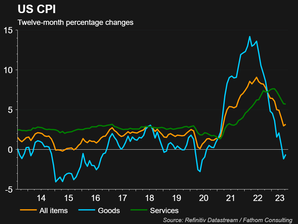
CPI – Goods vs. Services
Within CPI, the overall indicator can be broken out by the various components. Another way the view CPI at a high level beyond Core is Goods vs. Services. This has been important the last few years due to disruptions in the supply chain and consumer demand shifting heavily to Goods early on during the pandemic, then later to Services after restrictions were lifted. The graph below compares headline CPI (orange) with Goods CPI (blue) and Services CPI (green). When I first saw this graph about a year ago I was surprised how Services CPI ran so much lower than headline CPI, likely from globalization. While Goods CPI is now back at the lowest reading among the three, perhaps the recent onshoring of production will result in Goods CPI being higher than what we saw the past decade. And the Services component remains quite elevated and sticky, not only from the heavy demand post-pandemic but also picking up more of the wage inflation component since that is a bigger subcomponent over Goods.
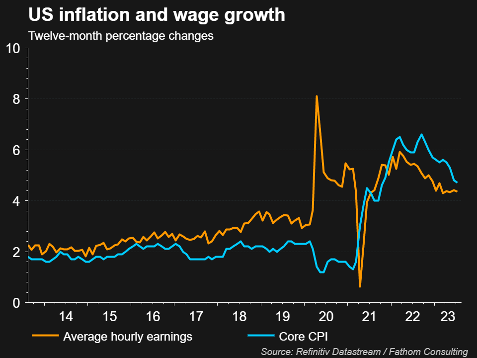
Wage Growth
The final graph with a further breakdown involves wages. Earlier I mentioned one mandate of the Federal Reserve is price stability. The other is full employment. That component has been running fairly strong with a very low unemployment rate. This results in higher wages which can keep inflation running higher for longer and allows the Fed to remain restrictive with interest rates. The graph below shows Core CPI (blue) next to average hourly earnings growth (orange). While this is also trending down, it is not nearly as fast as other components.
Inflation Readings and Fed Reaction … and SS COLA
Whether the Federal Reserve raises rates again and how long they will remain high depends heavily on how inflation plays out. While it is a welcome development to see inflation coming down for some components, more months of the trend must continue and more components participate in the decline before the Fed can let its foot off the brake of higher rates. Fed Chair Powell will speak at the Jackson Hole Economic Policy Symposium this Friday, August 25th. The markets will be watching. The July CPI print also had the CPI-W available which is the first of three readings used for 2024 Social Security COLA adjustments. Depending how much inflation changes over the next two months, the SS COLA adjustment may be in the 3% area for 2024.
Some of you may notice the price of gas is one component not decreasing as you embark on the “off to college” trips. I bet the price of gas is one of the last things on you and your child’s mind right now. Enjoy the special time and good luck to the students!
Posted by Kirk, a fee-only financial advisor who looks at your complete financial picture through the lens of a multi-disciplined, credentialed professional. www.pvwealthmgt.com