

4th and Final COVID Update - Context
This is my fourth and final blog post on COVID data. Similar to my first post in early April and subsequent posts, the intent is to provide graphs of key COVID metrics to put the numbers in context. And similar to my last post in mid-July, I will end on the exciting developments of promising vaccines.
Below are the key metrics I will summarize. Given recent news headlines, you would think the entire country is on fire. In fact, that was a quote from this article. I disagree. It is true there are areas seeing spikes in positivity rates (# of positive COVID tests as a % of total tests per day) and hospitalizations. But it is important to remember this doesn’t mean the number of deaths. We will have to see (17-21 day lag) how much lower the mortality rate is relative to earlier in the year. The experts now have a better understanding of COVID, enhanced treatments and lower average age of those infected are all factors that will likely keep the death rate lower than earlier in year.
- Data by age group – positive cases % vs. deaths %
- Positivity rate – positive cases per day / tests conducted per day
- Hospitalization relative to capacity
- Projected deaths per 100,000 population for select states
- Actual deaths per day by select states
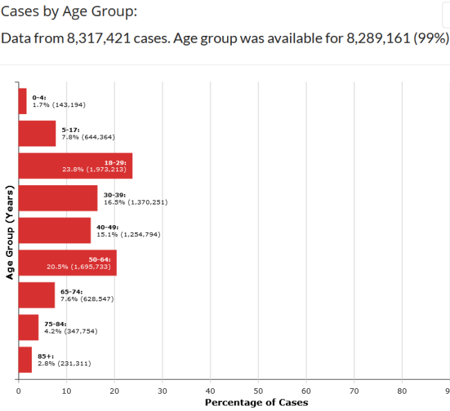
Data by Age Group
I initially had this metric last but moved it first to show why it would be very helpful if daily headline numbers also included the age distribution of those testing positive. The mortality rate is much lower at younger ages. I recognize the young can spread COVID to the old, thus the continued need for social distancing and masks inside if social distancing is not possible. But it also is important to help keep the large numbers reported in proper context.
The graphs below are from CDC.GOV and show the age distribution of those testing positive for COVID in the first graph and distribution of those dying in the second. (Note the site was updated 11/17/2020 but given the death count, appears to be data through about mid-September). The deaths captured in blue bars on the bottom are devastating, but as large number of new cases are reported recently, bear in mind a large % of that total group testing positive will likely be ok.
Grouping the age bands and comparing % of total cases vs. % of total deaths:
- 65% of the cases occur in age 49 and below but only 5% of total COVID deaths
- Taking that down to age 29 band, 33% of cases occur but only 0.6% of total COVID deaths
I don’t know what the age distribution was this spring, but I am guessing very few positive cases were under age 30, leading to a higher death rate given the number of positives reported at that time.
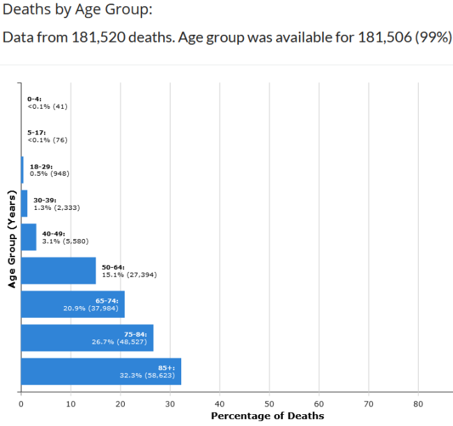
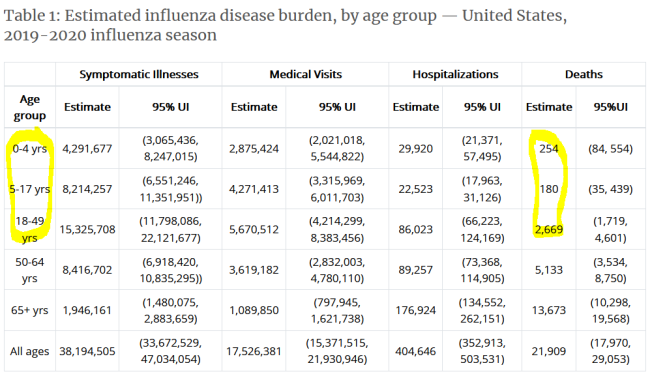
And at the risk of angering some, from the very beginning I always looked at COVID numbers relative to the flu so I could put the risk in context - yes I know COVID is worse - since we have lived with flu risk for years. Again it is devastating to see the blue bars above for the young ages below 18. But did you know that more people in those age bands die from flu than COVID? The CDC doesn't refine the 18-49 band for flu stats but even the number of flu deaths for that band is pretty high relative to COVID. Also notice the large number of medical visits and hospitalizations even for the young. I know my sisters who are nurses knew these stats on the flu, but I certainly didn't.
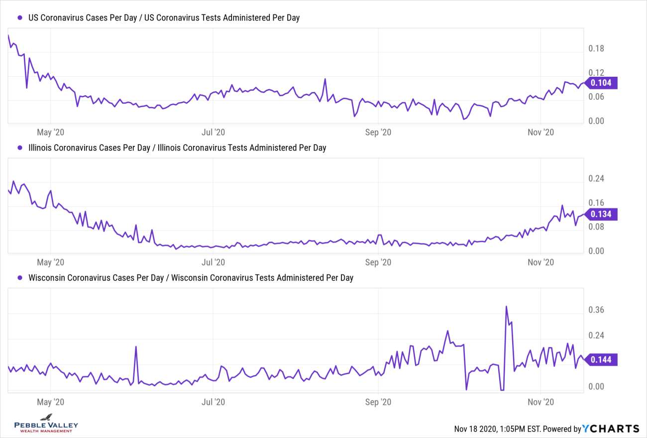
Positivity Rate
Here is the 7-day average positivity rate by state from Johns Hopkins. Green and yellow boxes are good; red is bad. You can see the northeastern states that dominated the news last spring are in good shape, as well as Georgia and Florida from this summer. California also remains in the low positivity zone. States in the upper Midwest are currently seeing high positivity rates, although they had relatively few cases up until now.
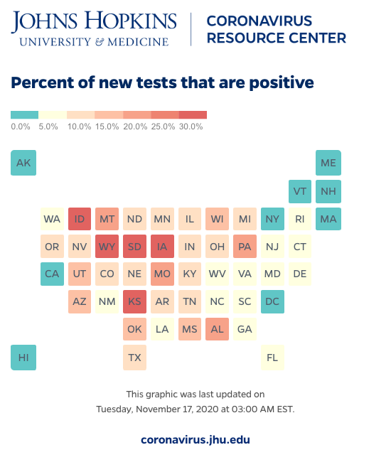
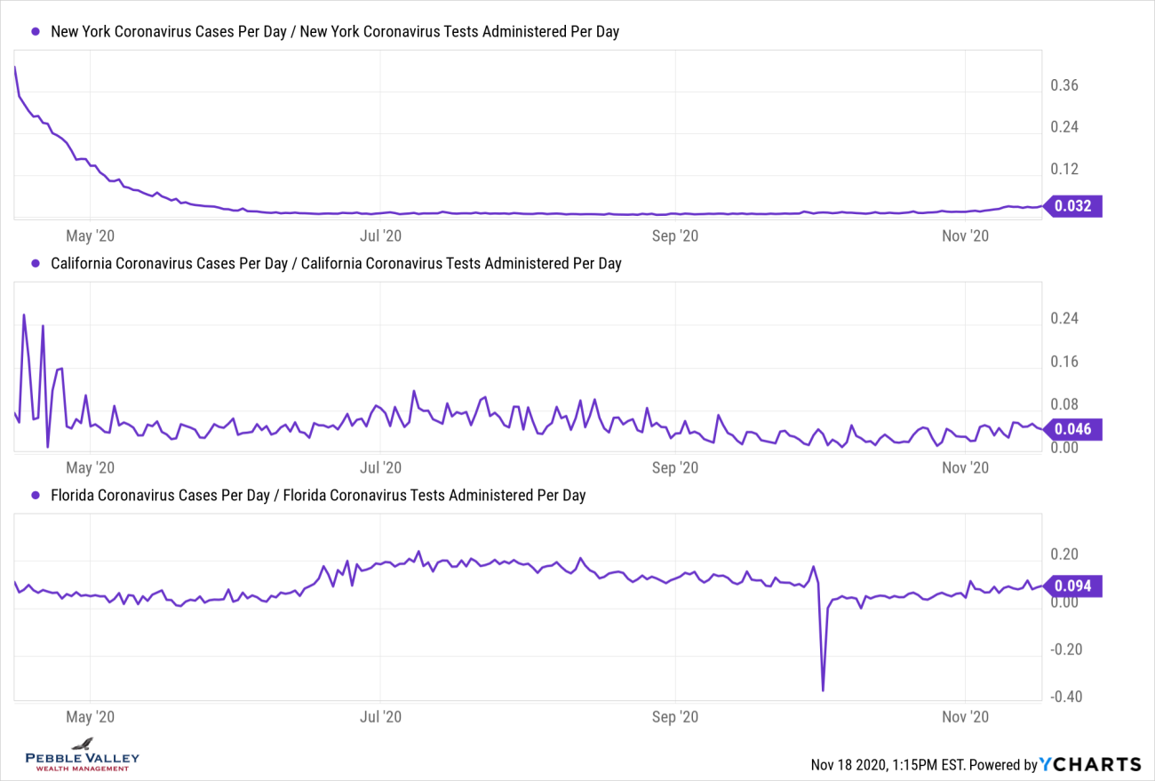
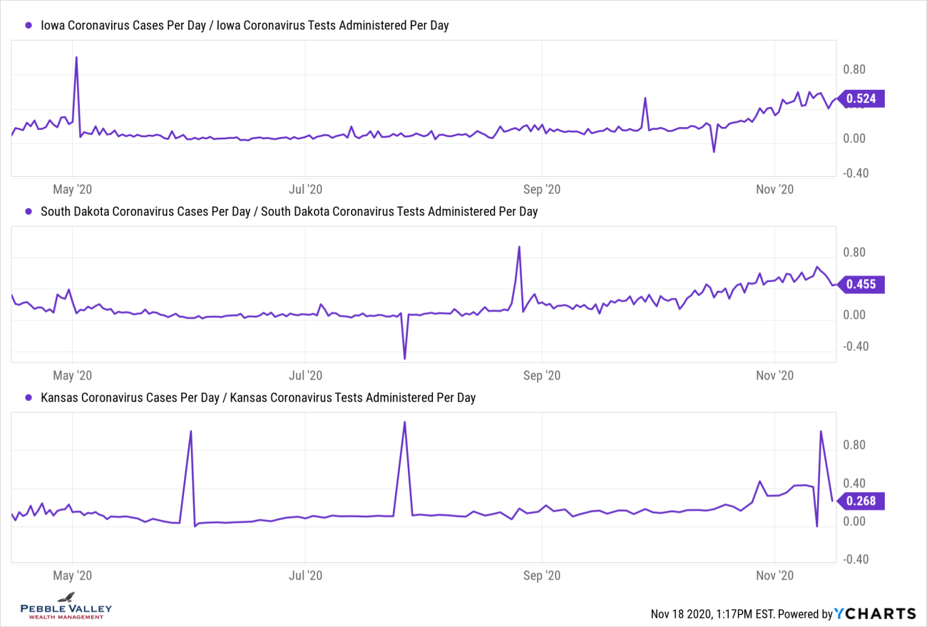
Now I will drill into select states’ positivity rate over time. Some states that are seeing a large recent rise had relatively low rates in the past - IA, SD, KS. Others, like Illinois, have trended upward again after coming down from past high readings. The overall US rate recently ticked above 10%; NY, CA and FL (among others) have stayed below that.
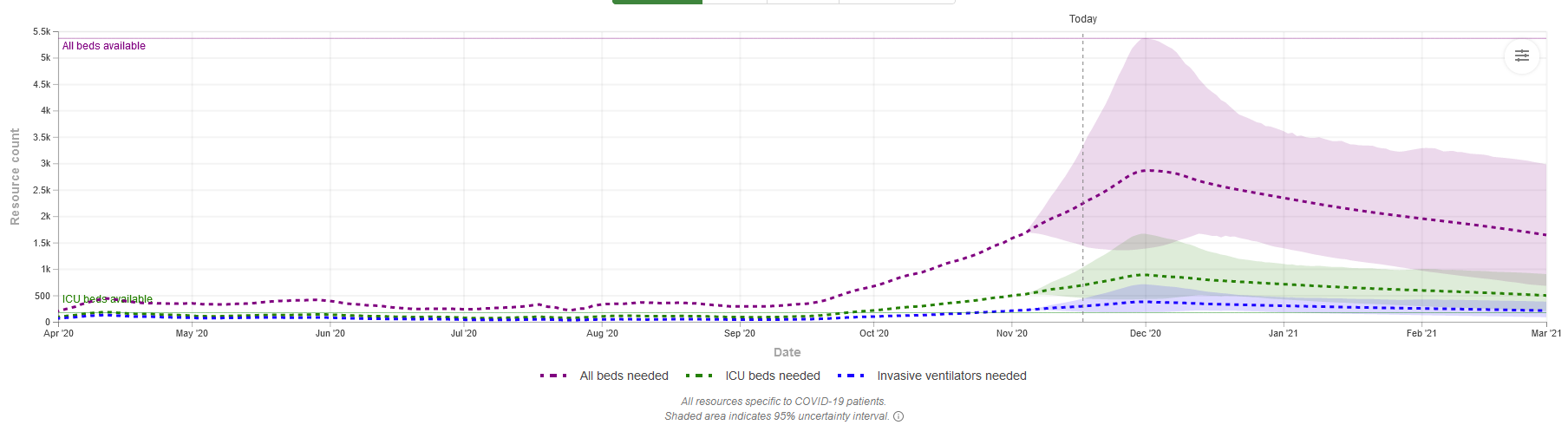
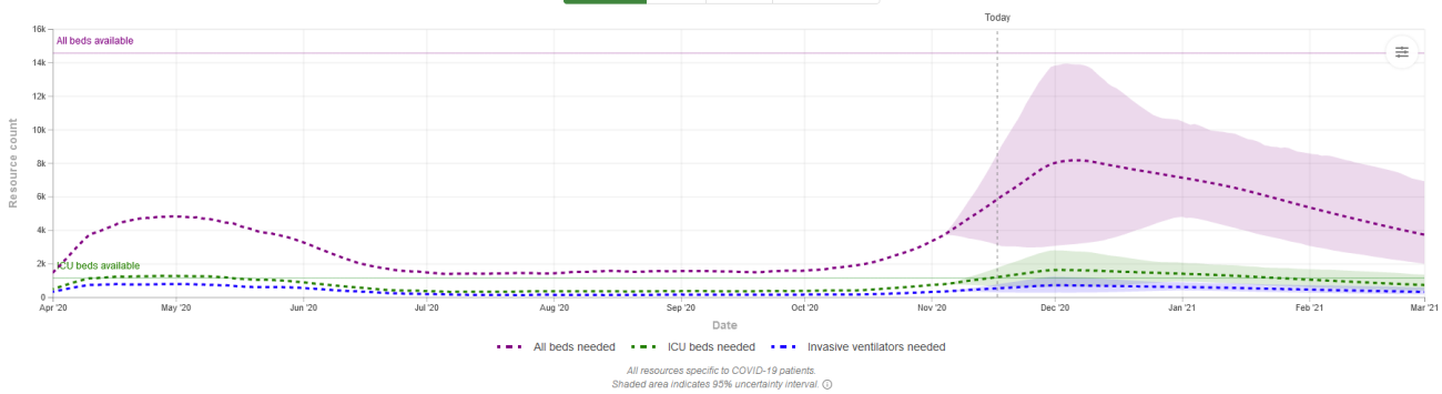
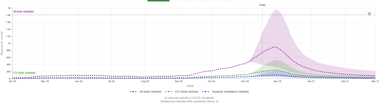
Hospitalization
This metric hasn’t been reported in the news as widely in the past; the focus then was ventilators. Using the IMHE data, I show the trends but also how compares to existing capacity. Admittedly this is at the state level and some regions within the state have different capacity. Local health officials look to regional capacity or other modifications like restricting elective surgery to increase capacity. In the spring many large cities established temporary hospitals that thankfully went largely unused. A few of those are being established again in Texas and Wisconsin.
Some states showing a high positivity rate like Iowa may have enough hospital capacity. Other states like Wisconsin with a much lower (though still above 10%) positivity may bump against capacity. The graphs are hard to read but the dashed purple line is "all beds" and dashed green is "ICU beds". The shade is the projected range. The solid line on left scale shows total availability.
IOWA - all beds ok; ICU slightly over
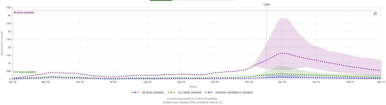
WISCONSIN - all beds close on high-end range; ICU over
ILLINOIS - all beds ok; ICU slightly over
SOUTH DAKOTA - all beds over on high end range; ICU over
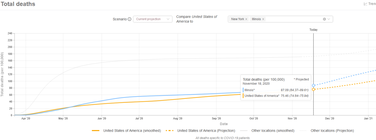
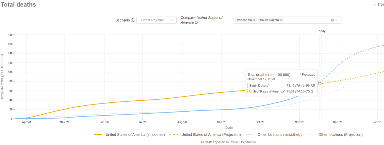
Projected deaths
Like the past blog posts, I summarize the number of projected deaths on a per 100,000 of population using data and graphing tool from IHME. Again, the graphs are hard to read but the yellow line line shows total deaths per 100,000 population for US since early April. I then show two states on each graph for comparison. I am only able to highlight one additional state so you will have to squint to see the other light shaded gray line.
Past IHME estimates were around 85 deaths per 100,000 population for overall US. We are currently at 75. Each state will have their wave at different times. NY was very early (first graph, light gray line) while IL was in line (first graph, blue line).
Other states like SD had very few deaths until October time frame but is projected to rise above 85 quickly (second graph, blue line) while WI also had few deaths until October but is currently only at 48 per 100k population and projected to stay below the US overall.
Actual deaths
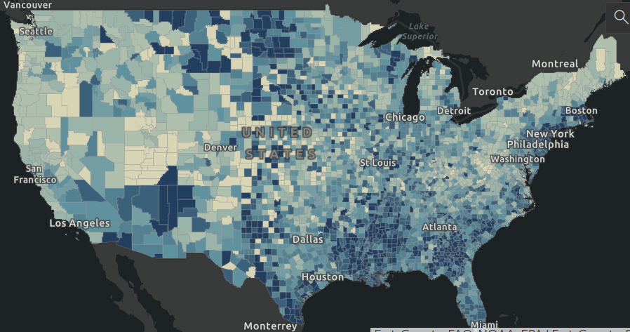
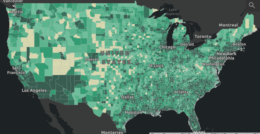
As mentioned above, there is a 17-21 day lag between infection and death, if it occurs. Using the Johns Hopkins website again, here are two graphics showing deaths across the nation, first as deaths per 100,000 population (blue shade, concentration in less populated areas), then in absolute terms (green shade, concentration in cities). The darker the shade the higher (bad) the number.
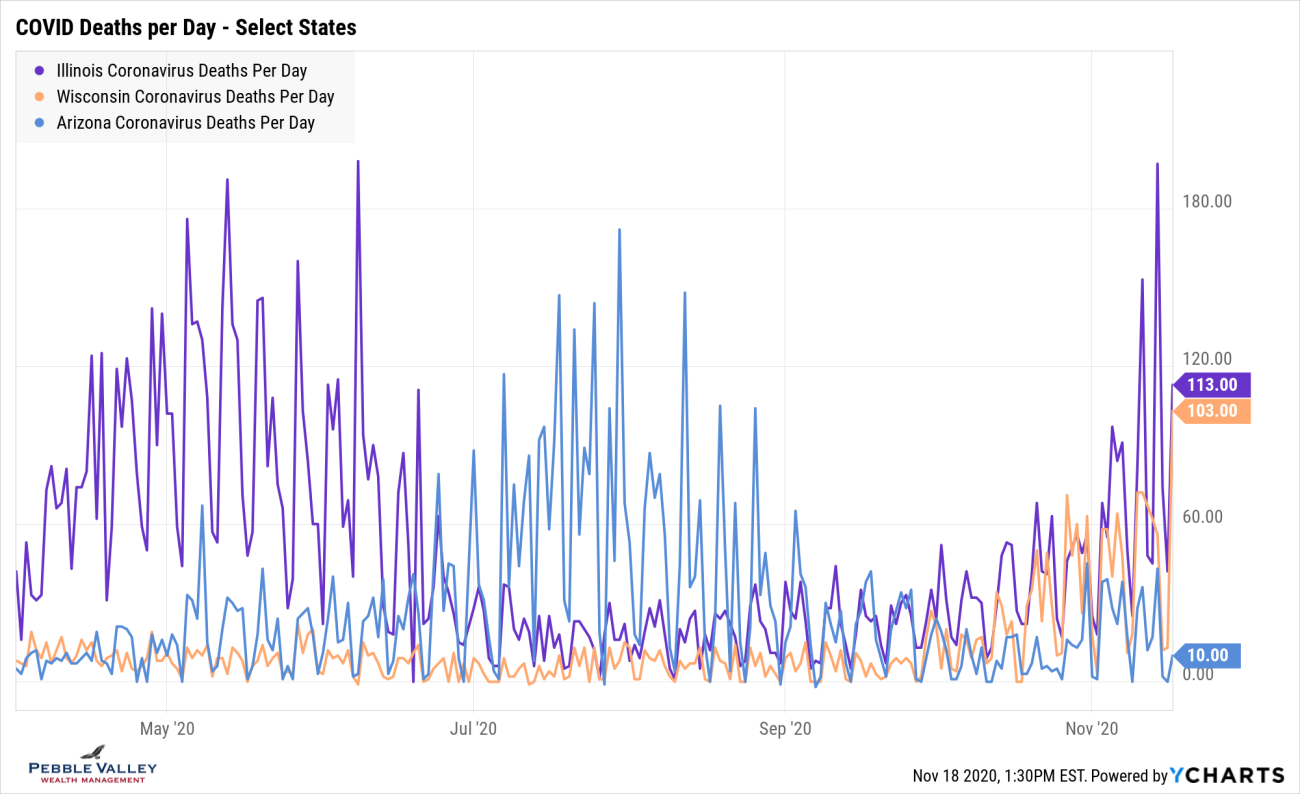
Similar to positivity graphs, I will drill into select states to show daily deaths over time. Time – and hardworking action by medical staff – will tell if the trend increases along with positive case counts or if the better understanding of COVID, enhanced treatments and lower average age of those testing positive will keep the death rate down.
This graph shows that WI had low daily death numbers until late October while AZ had their peak in the summer and appears to be settling down. IL, unlike most other states, had a relative peak in April/May and then settled down, but appears to be heating up again.
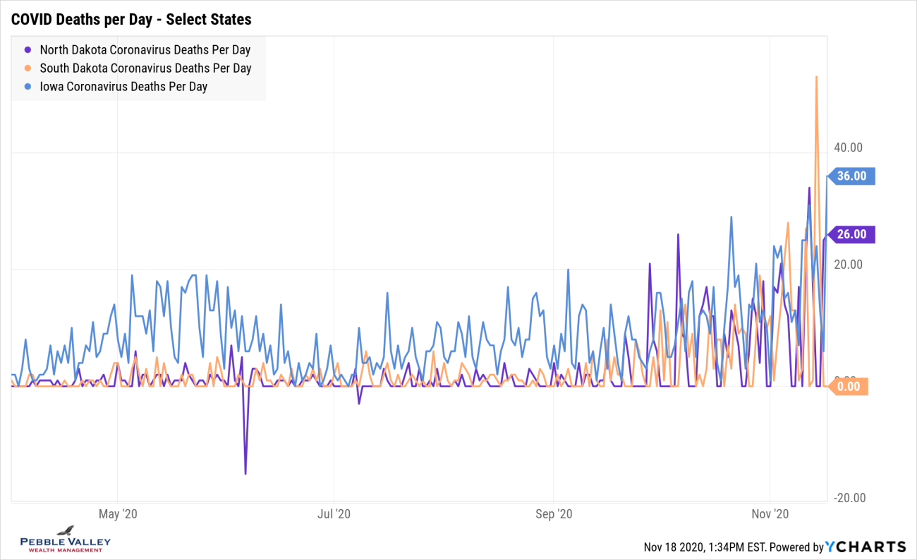
I then chose a graph showing states that are experiencing high positivity rates - ND, SD and IA. You will see they never had a large death numbers (IA had blip in April/May similar to IL) but are experiencing the deaths now.
Vaccines: Operation Warp Speed > Bureaucracy
Thank God we were able to marshal the resources of the military and private enterprise to develop, test, finance production well in advance of knowing which one would be effective and have two highly effective vaccines (with more to come) in less than a year.
Wow!
Pfizer had their announcement on Nov 9th followed by Moderna on Nov 16th (see NY Times Tracker). The effectiveness rates were shown to be an extremely high 95% (experts would have been very happy with 60-70%). Final testing and approval is needed before getting these vaccines into the health care profession and presumably those most at risk. There are details to be worked out (Pfizer’s must remain extremely cold) but given what was done in less than a year and the military involved with logistics, this is very promising. I will let you read the latest articles on these and future exciting developments. To be clear the FDA has not approved any for full use, but some will very soon be ready for limited or emergency use basis, likely for health care workers and others on the front line.
There you have it. Feel free to visit the websites, look up your own state or region of interest, and continue to be safe and smart as you carry on with your life. Happy Thanksgiving!
Posted by Kirk, a fee-only financial advisor who looks at your complete financial picture through the lens of a multi-disciplined, credentialed professional. www.pvwealthmgt.com
Sources:
Johns Hopkins - https://coronavirus.jhu.edu/map.html
IMHE - https://covid19.healthdata.org/united-states-of-america
Worldometer - https://www.worldometers.info/population/
CDC - https://www.cdc.gov/flu/about/burden/preliminary-in-season-estimates.htm